A touch-first control and status screen for live events. It runs next to KUMA on a wide bar display, on the second screen of a dual-screen laptop, or in any browser on a tablet or phone. No experience with this kind of software needed: this guide starts from zero.
Included with your KUMA licence. Dashboard uses the same 16-character licence code as KUMA Timer and takes its own seat: one Dashboard seat for every KUMA seat. Download it from the KUMA Dashboard section. Dashboard is currently a release candidate (0.1.0 RC3), so this guide may grow as it is finalised.
What KUMA Dashboard is
Think of Dashboard as a programmable control panel made of tiles. Each tile (we call it a box) can show a live value, change colour when something happens, and press a button when you tap it. You decide what the boxes show and where they sit, and you save the result as your own screen layout.
Dashboard gets its information from Bitfocus Companion. Companion is the free program that connects to all kinds of show equipment (video switchers, media servers, lighting desks, audio mixers …) and, with the KUMA Timer module, to KUMA. Companion knows hundreds of live values called variables (for example the timer, the name of the running cue, which camera is on air). Dashboard reads those variables and draws them the way you want.
When you tap a box, Dashboard can press a button in Companion, which can then do anything Companion can do: start the timer, cut to a camera, fire a lighting cue. Companion does the work; Dashboard is the face.
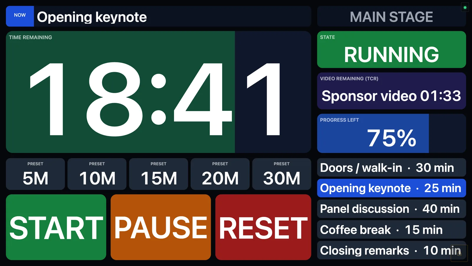
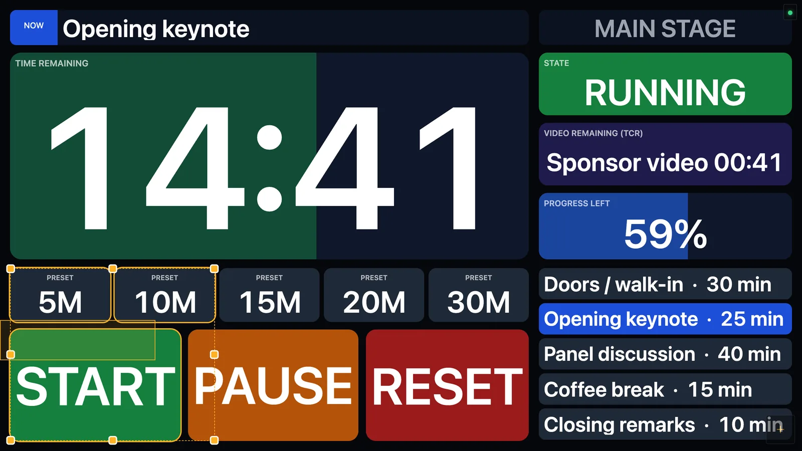
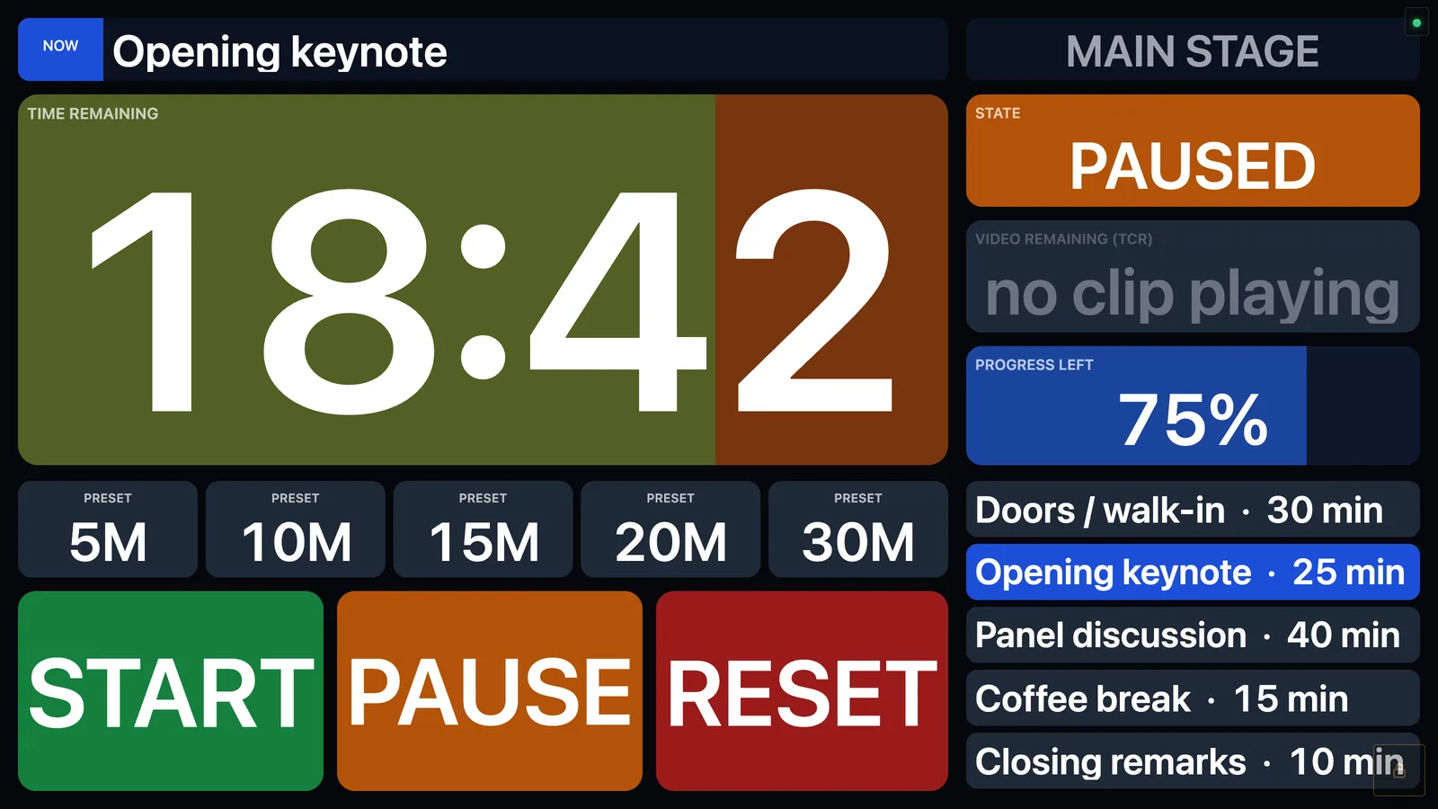
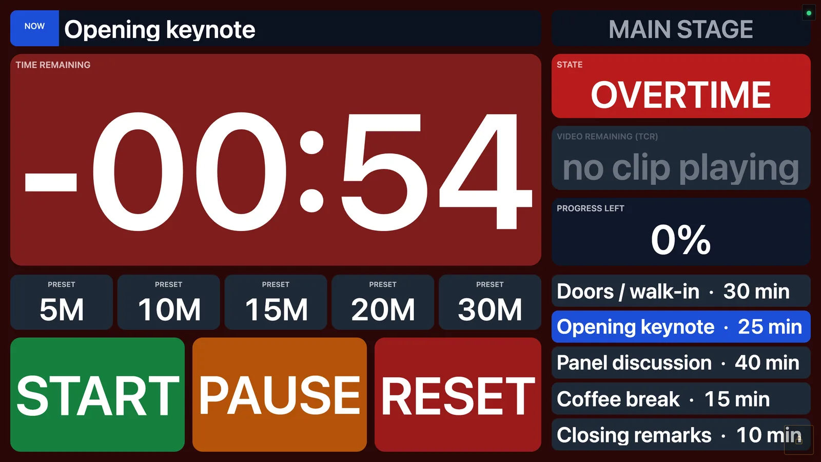
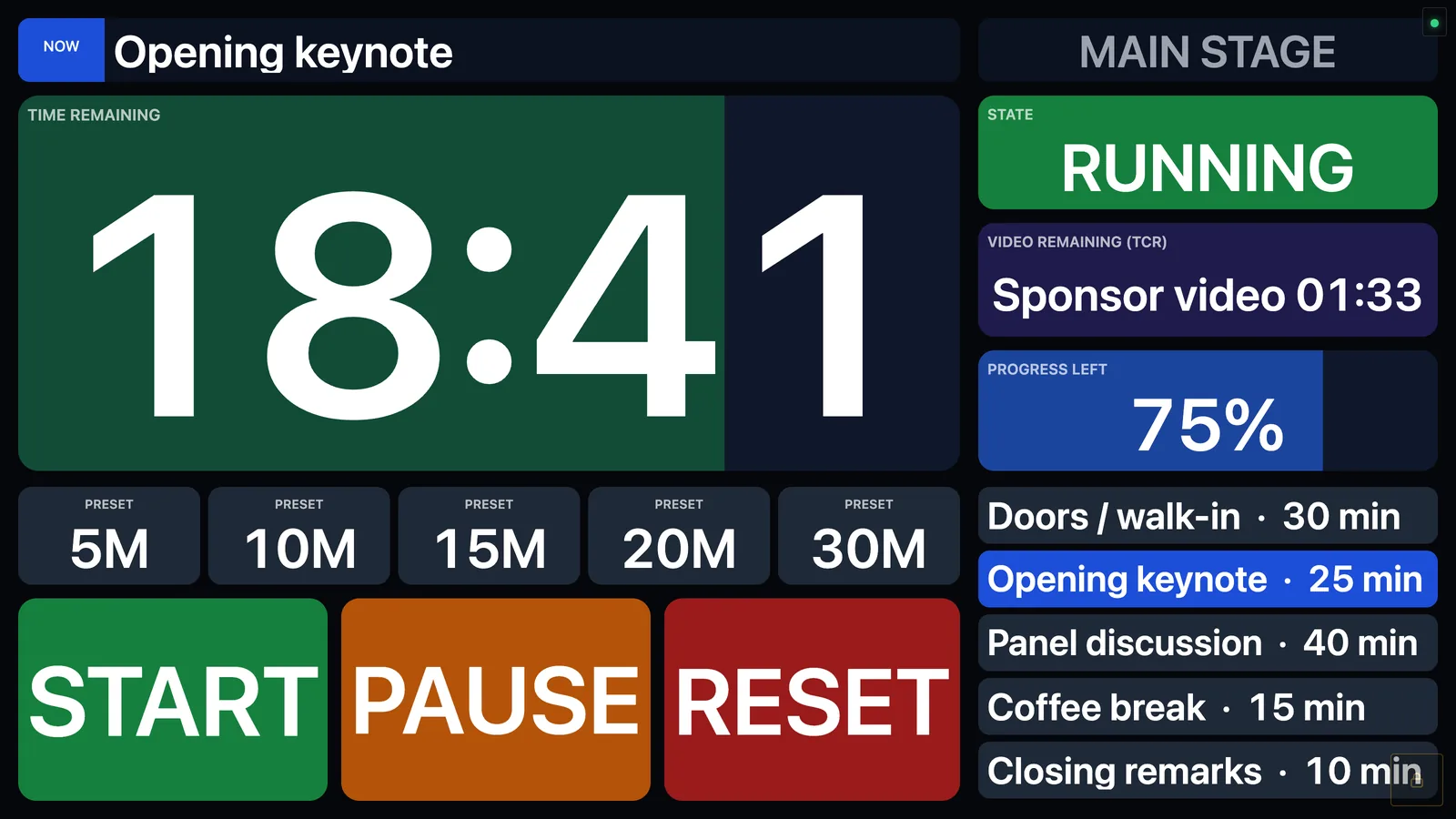
The finished example from this guide: one screen for a stage manager. Timer with progress bar, state, video time remaining, presets, big START / PAUSE / RESET buttons and the cue list.
What it is good for
Who
What they put on their Dashboard
Stage manager / show caller
The KUMA countdown, its state (RUNNING / PAUSED / OVERTIME), the running cue and the next ones, TCR (time left of the playing video), and big START / PAUSE / RESET and preset buttons. Everything on one screen, readable from an arm's length.
Video / graphics operator
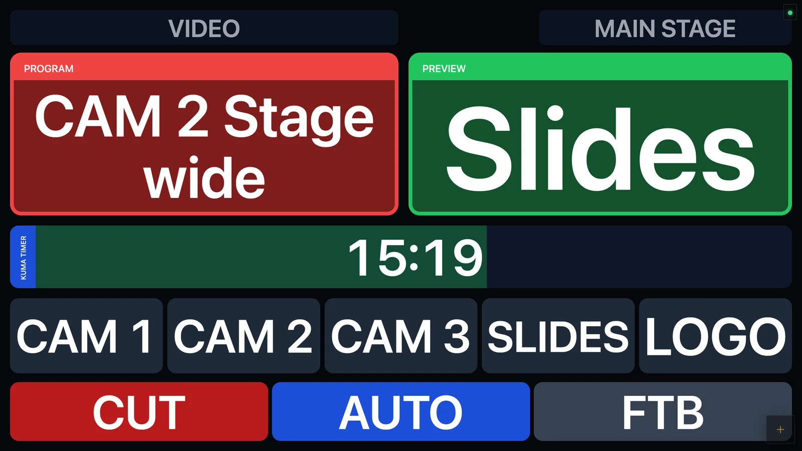
Program and preview sources of the switcher, CUT / AUTO / FTB, the remaining time of the playing clip, and the KUMA timer as a thin bar.
Audio, lighting, AV tech
A status wall: one green OK tile per device that turns red when Companion reports a problem. Ready-made with one tap from the presets.
Producer, backstage, FOH
A view-only copy of the same screen on a tablet or phone through the built-in web server. No app to install on the device.
Multi-room events
Several Companion computers on one screen, each box reading from the room it belongs to.
Where to run it
Dashboard is designed for screens where you can touch things, but a mouse works the same way. Four common set-ups:
1. Beside KUMA on a wide bar screen
Wide bar displays (for example the 2560×720 Corsair Xeneon Edge) are made for this. KUMA runs as a slim full-height strip on one side, and Dashboard fills the rest of the screen, so the timer and your controls sit together on one display. Dashboard's wide-screen mode lines the two up for you, and it can even follow KUMA automatically (Beside KUMA).
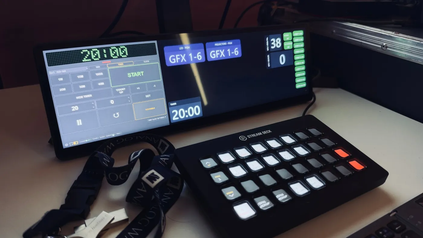
A real set-up: KUMA on the left, Dashboard on the rest of a 2560×720 bar screen, a Stream Deck in front.
2. On the second (touch) screen of a laptop
Dual-screen laptops such as the ASUS Zenbook Duo have a second, touch-sensitive screen below the main one. Put KUMA or your show software on the top screen and Dashboard on the bottom one: instant touch buttons for START, PAUSE, presets and cues, with the timer always in view. Any laptop with an extra touch monitor (a portable USB-C touch display works well) does the same job.
3. On a tablet or phone, in the browser
Dashboard has a built-in web server. Turn it on and the same screen opens in any browser on your network: an iPad on the production desk, a phone in the wings, a TV in the green room. Without a password the browser is view-only; with a password you can sign in and edit or press buttons from the tablet. See Web server.
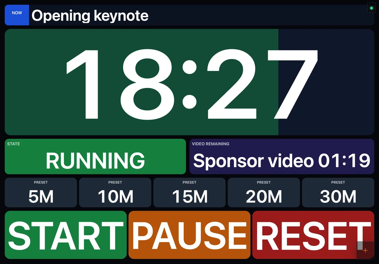
The same dashboard in a tablet browser (4:3 layout, designed for that screen's shape).
4. On any computer with a mouse
Mac or Windows, in a normal window, or in full screen. Nothing needs to be installed on the show computer itself: Dashboard can run on a different computer, even on a different network from KUMA, as long as it can reach Companion.
Design for the screen you will use. A dashboard is drawn on a canvas that is scaled to the width of the window, so its shape follows the screen. A layout drawn for a 16:9 screen is cut off at the bottom on a very wide bar screen. Make one page per screen shape (see Design width). The example dashboard in this guide has a 16:9 page, a wide-bar page and a tablet page.
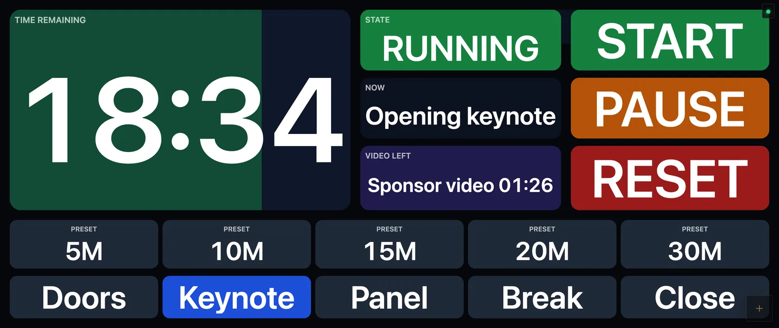
The wide-bar page: the same information redrawn for the 2.37:1 part of a bar screen that is left next to KUMA.
Quick start (10 minutes)
Install Dashboard (macOS or Windows) and start it. Details.
Activate it with the same licence code you use for KUMA.
Connect to Companion: menu → LINK. If Companion runs on the same computer the default (127.0.0.1:8000) is already right. Details.
Add the KUMA boxes: menu → BOX → Presets… and press Add next to Timer with progress bar, then Status and cue and TCR. Drag them where you want them. Details.
Add a button: New box, type START in the value, then ACTION → Press a Companion button and enter the page / row / column of the Companion button. Details.
Lock the layout with the padlock at the bottom of the menu. Boxes now react to taps. Details.
That is a working control panel. The rest of this guide explains each part and then shows how to make it look the way you want.
Installing and activating
Dashboard is a normal desktop application for macOS (Apple silicon) and Windows (10 / 11). Download the installer from the Dashboard section of the download page, install it like any other program and start it.
Activating
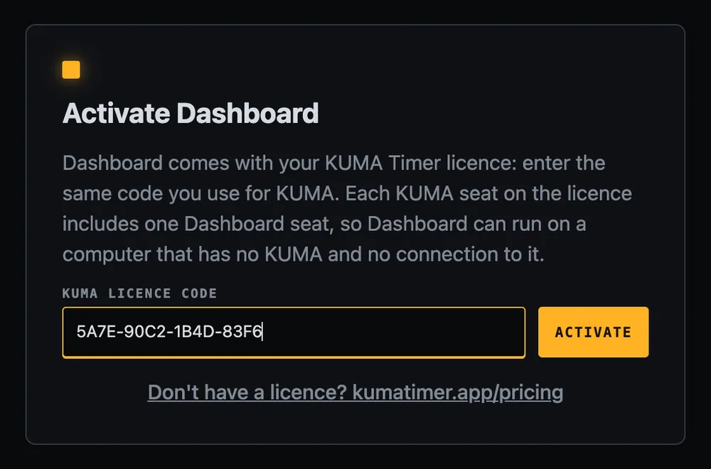
The first screen asks for your licence code. Enter the same 16-character code you use for KUMA Timer (for example AAAA-BBBB-CCCC-DDDD) and press Activate. The computer takes one Dashboard seat on your licence, and Dashboard opens. There is no separate trial: Dashboard needs a paid KUMA licence code (the free Lite version has no code).
The activation screen. Enter your KUMA licence code (the one shown here is a placeholder).
One seat per computer. A single licence has one Dashboard seat; a 20-seat site licence has 20. They are counted separately from your KUMA seats, so Dashboard never uses up a KUMA seat.
Offline is fine. Dashboard checks the licence in the background and keeps working without internet for at least two weeks, so a venue with no connection is not a problem.
Moving to another computer. Open menu → SYS → Licence → Give this seat back, then activate on the other computer. You can also release a seat in the licence portal under KUMA Dashboard seats. If every seat is in use, Dashboard tells you which computers hold them.
A first look
After activation you see a black canvas: this is your dashboard. Everything you build lives on it. All the settings are in one menu that slides in from the left.
The round + button at the bottom right opens the menu (or press and hold on any box or empty space for about half a second).
A small green dot at the top right shows that Companion is reachable (red when it is not).
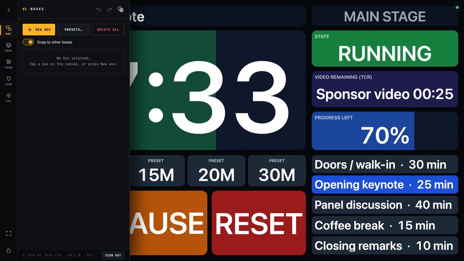
The menu has a slim rail of six sections on its left edge, then the settings for the selected section.
The menu open on a finished dashboard. Rail on the left: BOX, PAGE, VIEW, LINK, (WEB) and SYS; padlock and full-screen at the bottom.
Rail button
What it is for
BOX
Create, select, style and arrange the boxes. The most used section.
PAGE
A dashboard can have several pages (for example Show control and Video).
VIEW
Look of the whole screen: font, background, scaling and animations.
LINK
Which Companion computers Dashboard talks to.
WEB
The built-in web server for tablets and phones (desktop app only).
SYS
Licence, wide-screen window options, save / load your layout, updates.
Locks editing and turns the dashboard into a control panel. See Locking.
At the top of the menu panel are Undo and Redo. Almost every change can be undone, so you can experiment freely.
Connecting to Companion
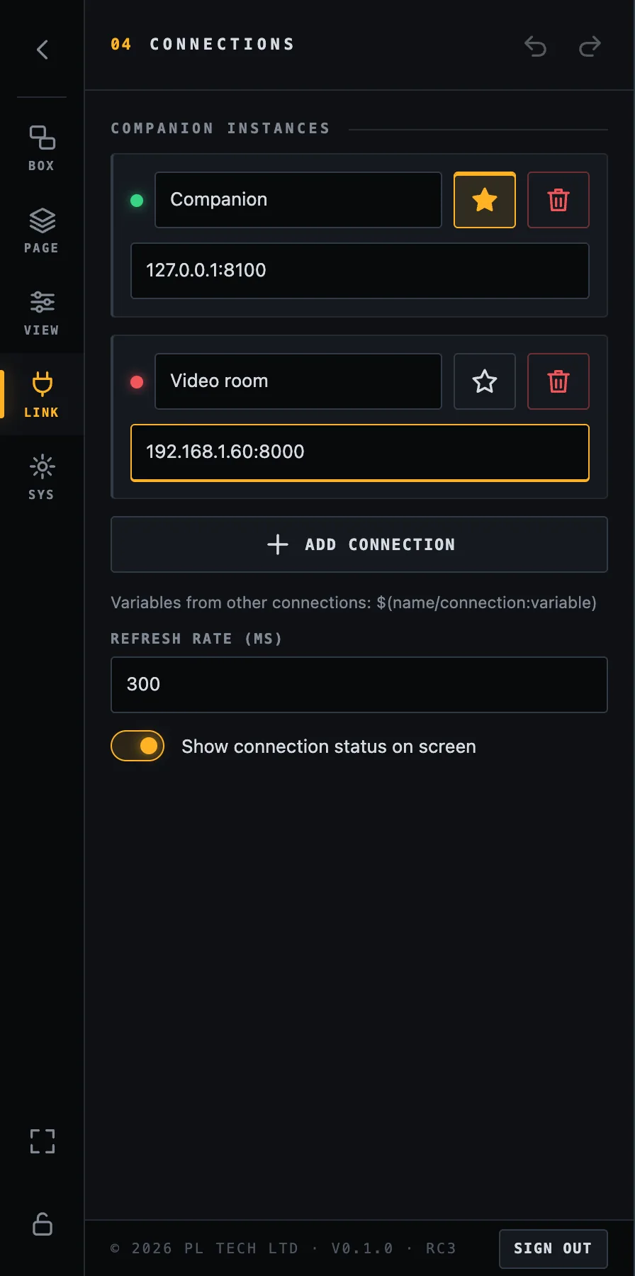
Open LINK. A new Dashboard already has one connection called Companion at 127.0.0.1:8000, which is right when Companion runs on the same computer. If Companion is on another computer, type its IP address and port instead (for example 192.168.1.60:8000). The address is shown at the top of Companion's own window.
LINK: the default connection (star, green dot = reachable) and a second one added for another computer (red dot = not reachable).
Status dot: green when Companion answers, red when it does not.
Name: a short alias you can use in variables from several computers (see below).
Star: the default connection. Boxes use it unless you say otherwise.
Add connection for a second Companion (a second room, a second computer).
Refresh rate in milliseconds: how often Dashboard asks for new values (300–500 ms feels live; the minimum is 100).
Show connection status on screen: the little dots at the top right of the dashboard. Switch them off on a finished show screen if you prefer a clean look.
Boxes read from the default connection by default. A variable of another connection is written $(name/connection:variable), where name is the alias you gave it. You rarely type this by hand: the variable picker (below) fills it in.
Your first box
Everything on a dashboard is a box. Let us build the most useful one: a live timer.
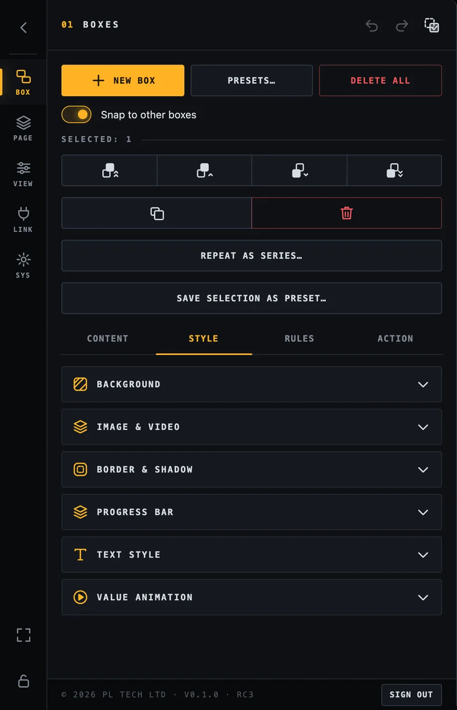
Open BOX and press New box. A box appears and is selected (a gold frame with handles). The settings for that box open below.A new box (top right) is selected. The settings are in four tabs: Content, Style, Rules, Action.
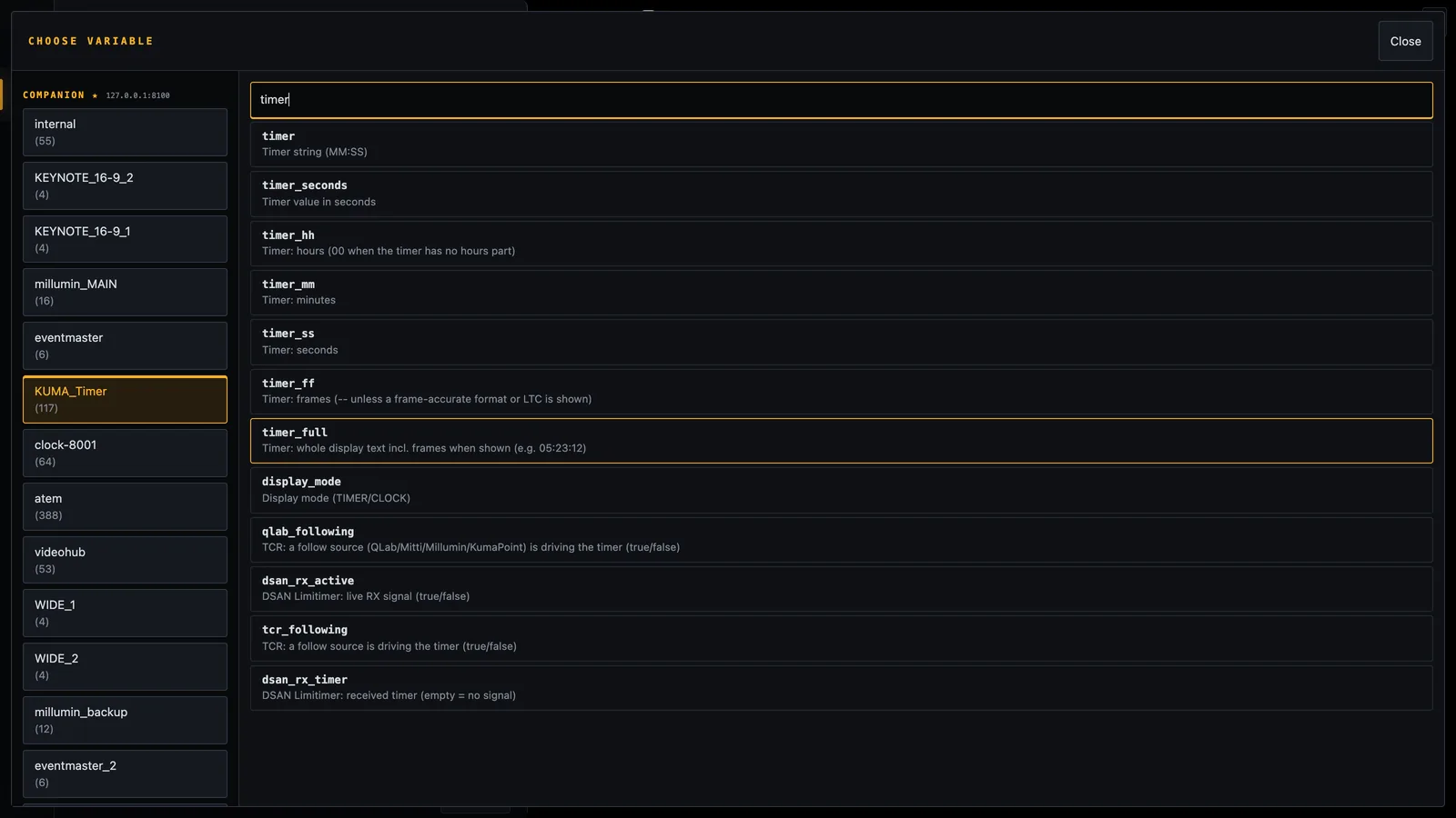
In Content → Value press + Insert variable…. The variable picker opens: on the left every module Companion knows (grouped by connection), on the right its variables with a plain description. Pick KUMA_Timer, type timer in the search box and tap timer.The variable picker. Left: modules. Right: searchable variables with descriptions. Tap one to insert it.
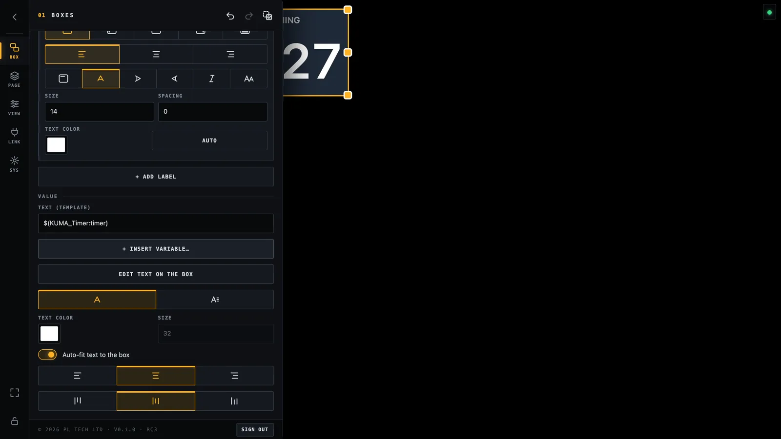
The box now shows the live time. What you inserted is written in the Text (template) field as $(KUMA_Timer:timer). That is all a variable is: a name in $( ) that Dashboard replaces with the current value, several times a second.The value is set. The box already shows the timer; the text field shows the template.
Drag the box where you want it, drag a handle to resize it, and turn on Auto-fit text to the box so the number grows with the box.
You can mix text and variables in one box, for example Cue: $(KUMA_Timer:cue_name). If a value is missing Dashboard shows …; if Companion cannot be reached it shows ⚠.
Working on the canvas
You want to…
Do this
Select a box
Tap or click it. Its settings appear in BOX.
Move a box
Drag it. It snaps to other boxes (switch off with Snap to other boxes).
Resize a box
Drag one of the eight handles on the selected box.
Select several boxes
Drag a rectangle on the empty canvas (it selects every box it touches), or Shift / Ctrl / Cmd + tap, or switch on Multi-select in the menu header and just tap boxes (made for touch screens).
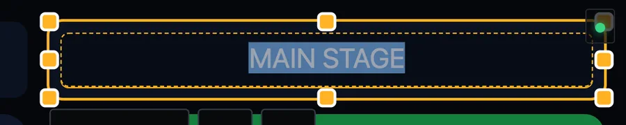
Edit the text right on the box
Double-tap it (or Content → Edit text on the box).
Open the settings of a box
Press and hold it for half a second. This also works while the menu is closed.
Hide, duplicate or delete
Right-click a box for the menu. Duplicate and delete are also in the selection tools at the top of BOX.
Dragging a rectangle over empty canvas selects every box it touches.
Keyboard shortcuts
Keys
Action
Ctrl/Cmd + Z
Undo
Shift + Ctrl/Cmd + Z or Ctrl/Cmd + Y
Redo
Ctrl/Cmd + C / V
Copy / paste boxes
Ctrl/Cmd + D
Duplicate the selection
Delete or Backspace
Delete the selection
Arrow keys
Nudge the selection by 1 pixel (Shift = 10 pixels)
Shortcuts work while the layout is unlocked and you are not typing in a text field.
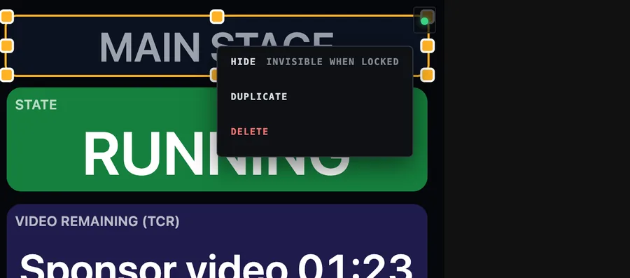
Right-click menu on a box: Hide (invisible when the layout is locked), Duplicate, Delete.
Hide is handy for boxes you only need sometimes: a hidden box is greyed out while you edit and completely invisible once the layout is locked.
Box settings: Content
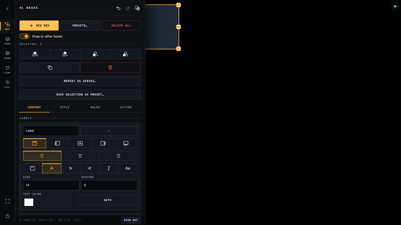
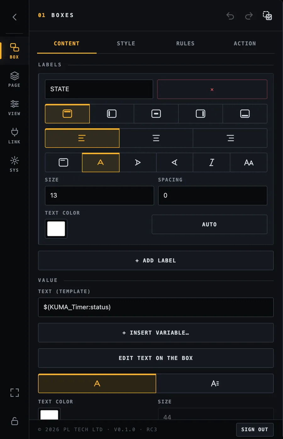
With a box selected the BOX section shows tools for the selection on top and four tabs below. Content is about what the box says.
Content tab: labels first (here the label “STATE” on top of the box).
Labels
A label is a small caption on one edge of the box, such as STATE above a status or PROGRAM on a camera tile. A box can have several labels. For each label you choose:
the text (variables work here too, for example $(KUMA_Timer:cue_name)),
its position: top, left, centre, right or bottom, and where it sits along that edge,
Bar on or off: a bar draws the caption as a filled strip flush with the box edge (see the blue NOW strip in the screenshots), with its own colour (colour or variable) and thickness,
rotation for vertical text, italic, UPPERCASE, size, letter spacing and text colour (Auto uses the box's own colour, dimmed).
Value
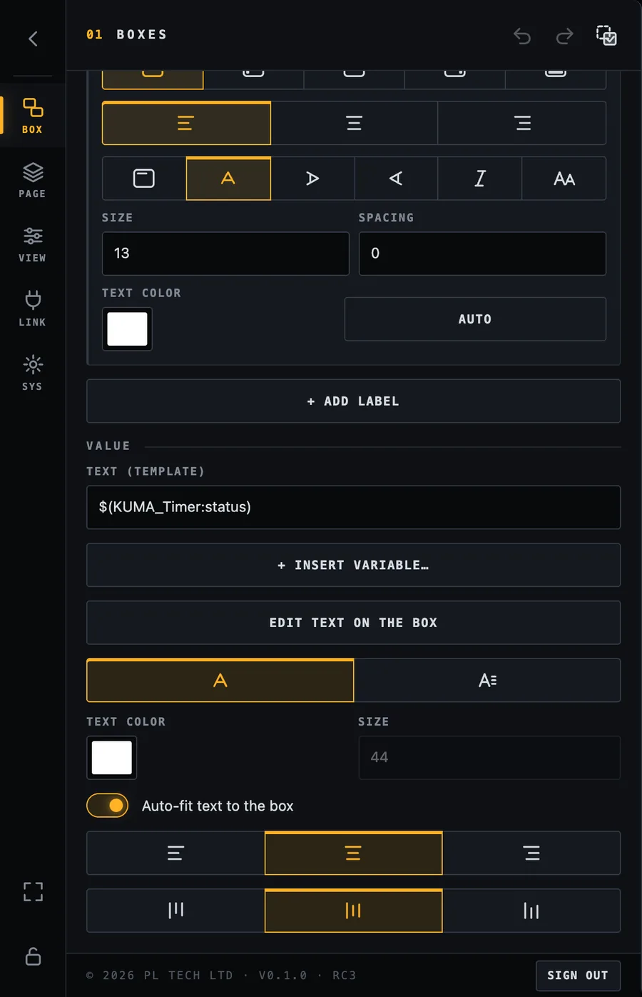
Value: the text template, the variable picker, in-box editing, plain or formatted text, colour, size, auto-fit and alignment.
Text (template): what the box shows. Type text and insert variables with + Insert variable….
Edit text on the box lets you type directly on the canvas.
Text colour and Size, or Auto-fit text to the box, which resizes the text to fill the box (recommended for timers).
Alignment left / centre / right and top / middle / bottom.
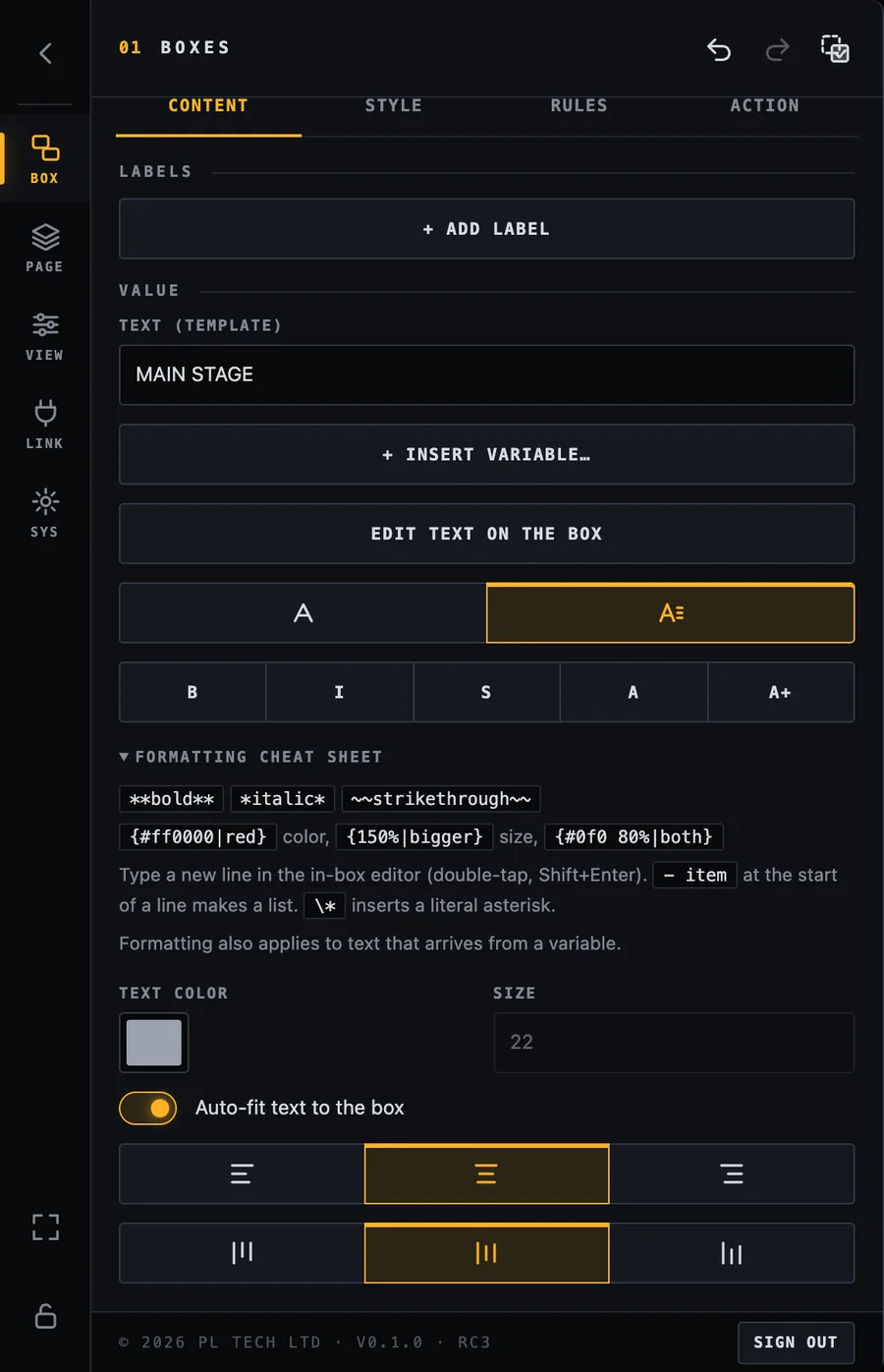
Formatted text
Switch the text mode from plain to formatted to use a little mark-up: **bold**, *italic*, ~~strikethrough~~, colour with {#ff0000|red}, size with {150%|bigger}, and - item at the start of a line for a bullet list. Formatting also works on text that arrives from a variable. The Formatting cheat sheet in the menu always shows the rules.
Formatted text mode with the cheat sheet and shortcut buttons (B, I, S, colour, size).Editing text directly on the box: the small bar offers + VARIABLE, accept and cancel.
Box settings: Style
Style is about how the box looks. It is divided into folding groups so the panel stays short.
Style: six groups. Tap a group to open it.
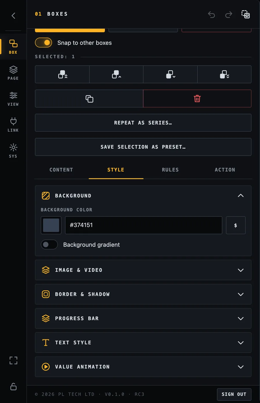
Background
A colour (pick it, type a hex code such as #1f2937, or use a variable that holds a colour) and an optional two-colour gradient with an angle. Rules can override the background (see Rules).
Background colour and gradient.
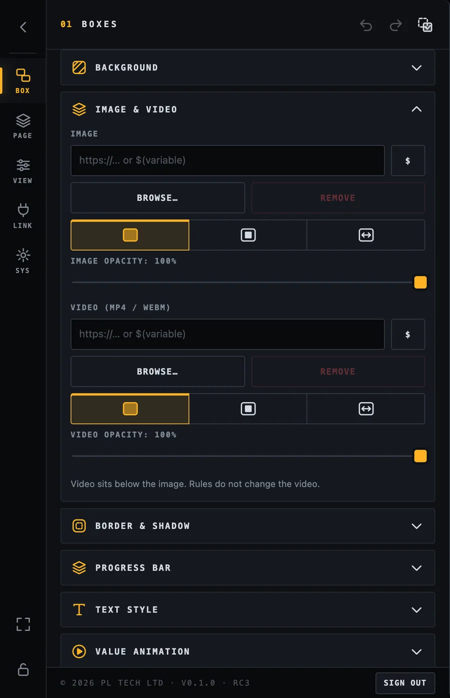
Image and video
Put a picture or a looping video behind the text: pick a file from your computer (it is copied into Dashboard, so it keeps working even if you move the original), give a web address, or use a variable that holds an address. Choose cover (fill and crop), contain (show all) or stretch, and set the opacity. The video sits below the image. Images can be switched by rules (for example a different icon when something is on); videos cannot.
Image and video fields, with fit and opacity.
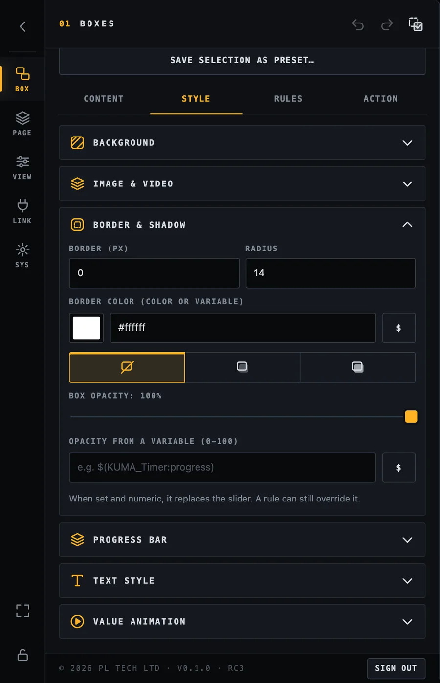
Border and shadow
Border width and colour, corner radius, shadow (none / soft / strong) and the opacity of the whole box. The opacity can also come from a variable between 0 and 100, for example to fade a box out as something finishes.
Border, radius, shadow and opacity.
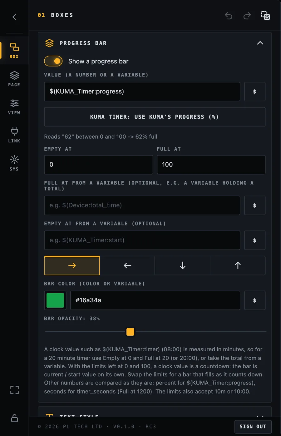
Progress bar
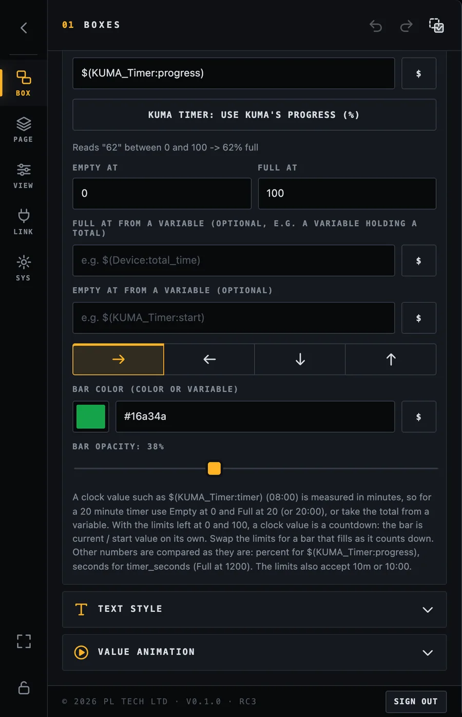
Turn a box into a bar that fills as a number changes: a countdown that empties, a media clip that plays, a fader level. Set the value (a number or a variable), what value means empty and what means full, the direction the bar grows, and its colour and opacity.
For a KUMA timer press KUMA timer: use KUMA's progress (%). It uses KUMA's own progress value (0–100) which is exact for any timer length and stays right even if Dashboard is started in the middle of a countdown. A line under the settings always shows what the bar is reading right now, so you can see at once if a variable or unit is wrong.
Progress bar: value, quick button for the KUMA timer, empty / full limits, direction and colour.The same group scrolled down: limits from variables, direction arrows, bar colour and opacity, and the notes for clock values.
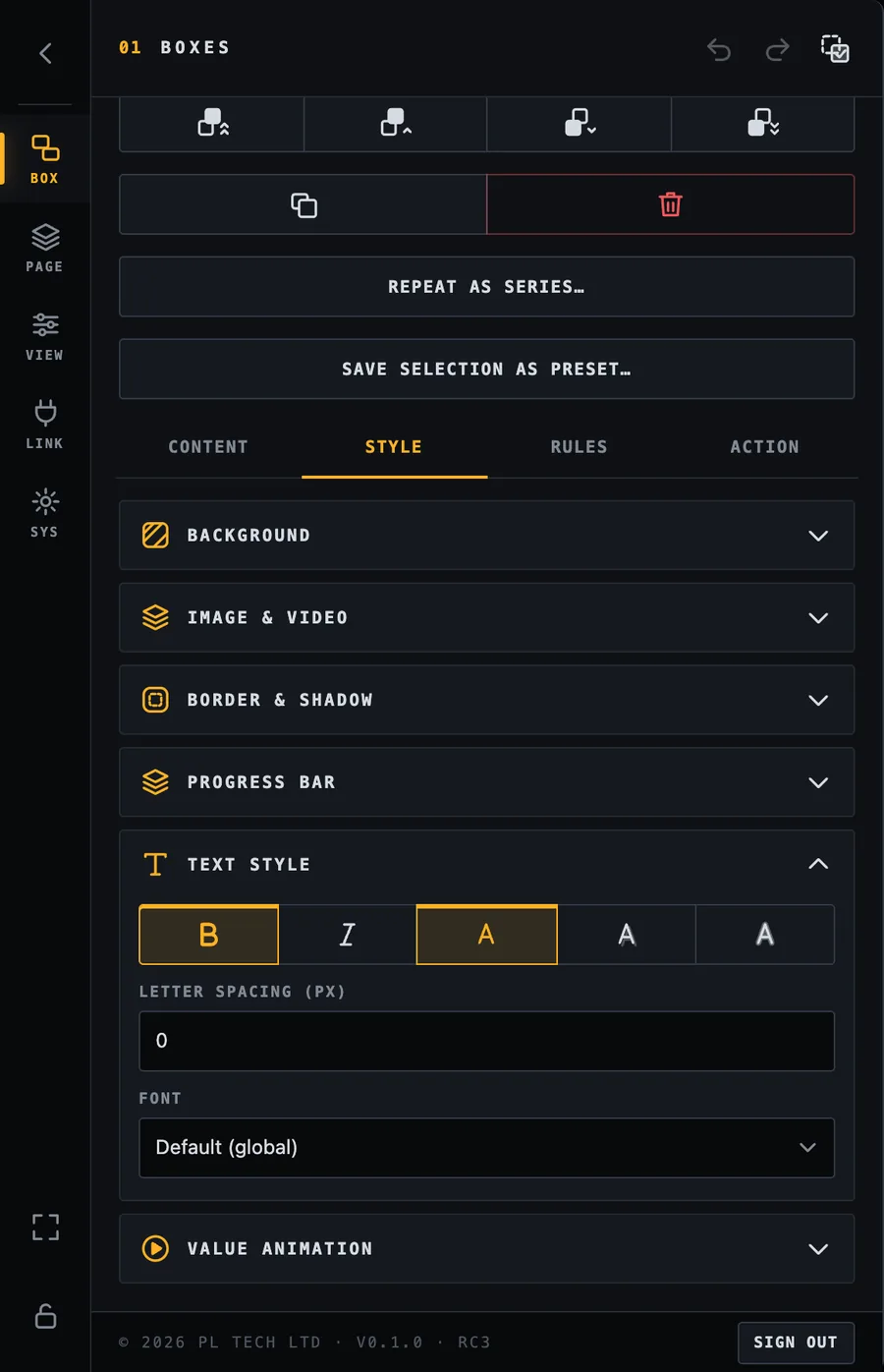
Text style
Bold, italic, a text effect (none / shadow / outline) for readability on pictures, letter spacing, and the font for this box (the default is the global font from VIEW).
Text style.
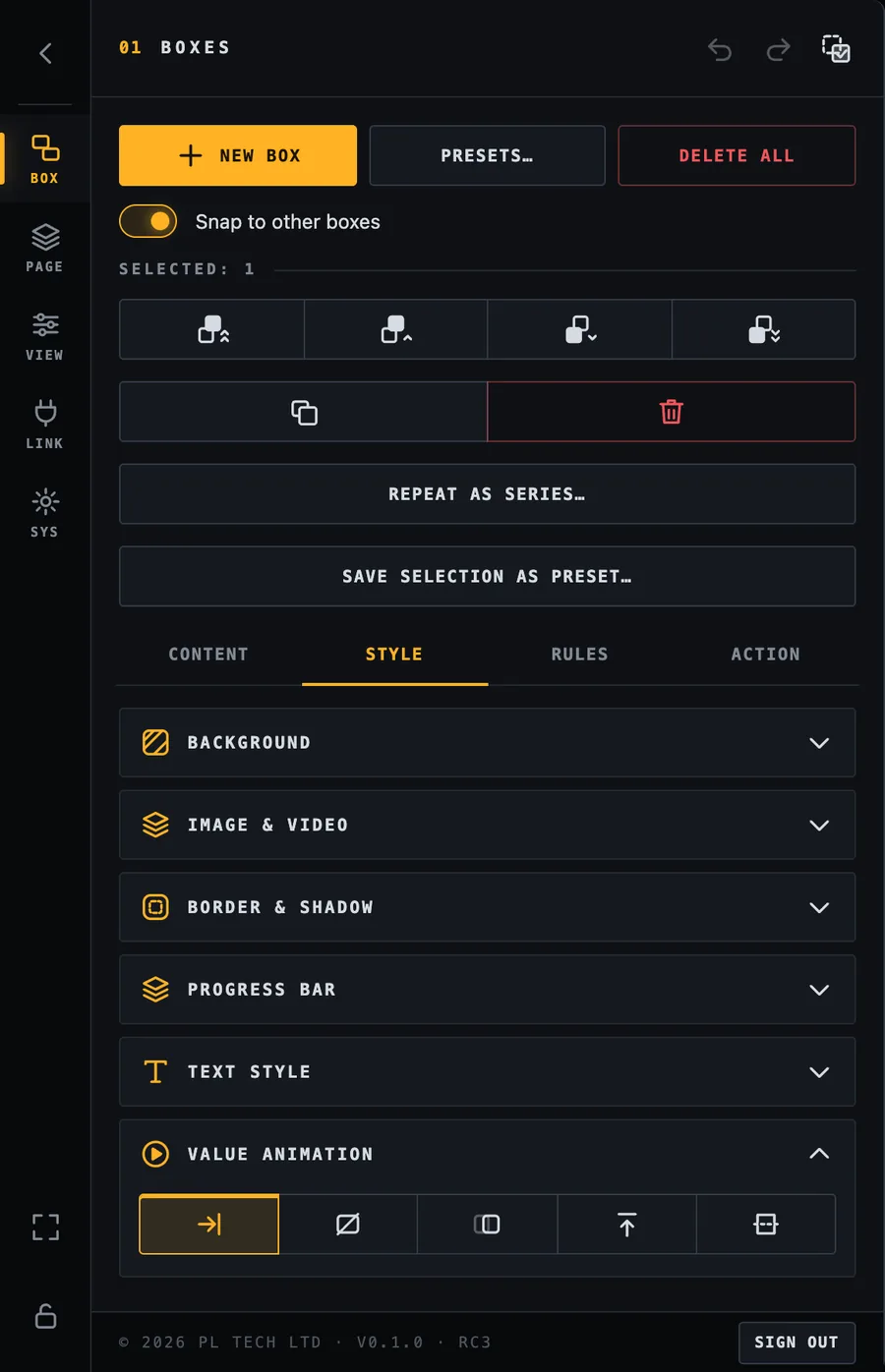
Value animation
How a changing value appears: nothing, fade, slide or flip. Default follows the global setting in VIEW. Animations are skipped automatically if the computer asks for reduced motion.
Value animation per box.
Box settings: Rules (make boxes react)
Rules are what make a dashboard come alive. A rule says: when this variable matches, change how the box looks. The first rule that matches wins, so put the most important one on top.
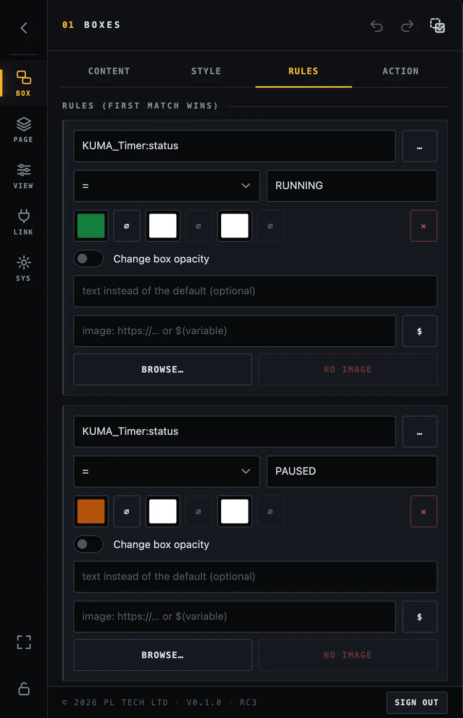
Example from the finished dashboard: the STATE box is grey by default, green while KUMA_Timer:status is RUNNING, orange for PAUSED and red for OVERTIME.
Rules tab: three rules on the STATE box. Each has a variable, a comparison, a value and the colours it applies.
Each rule has:
a variable (type it or tap … to pick it),
a comparison: equals (=), not equal, greater / smaller (numeric), is empty, is not empty, contains, does not contain,
a value to compare with,
what to change when it matches: background colour, text colour, border colour, box opacity, the text itself (for example show no clip playing when nothing plays) and the image. Anything left empty (∅) stays as the box normally is.
Shortcuts for many rules
Indicator from flag… builds an ON / OFF light in one step: pick a variable that is true or false and the box turns grey OFF and green ON.
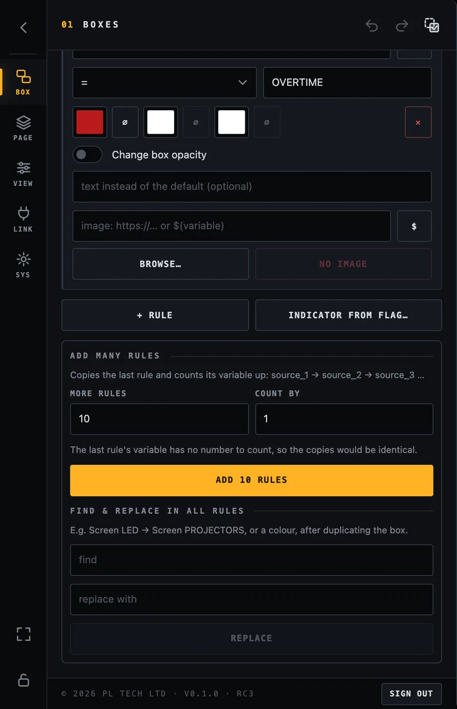
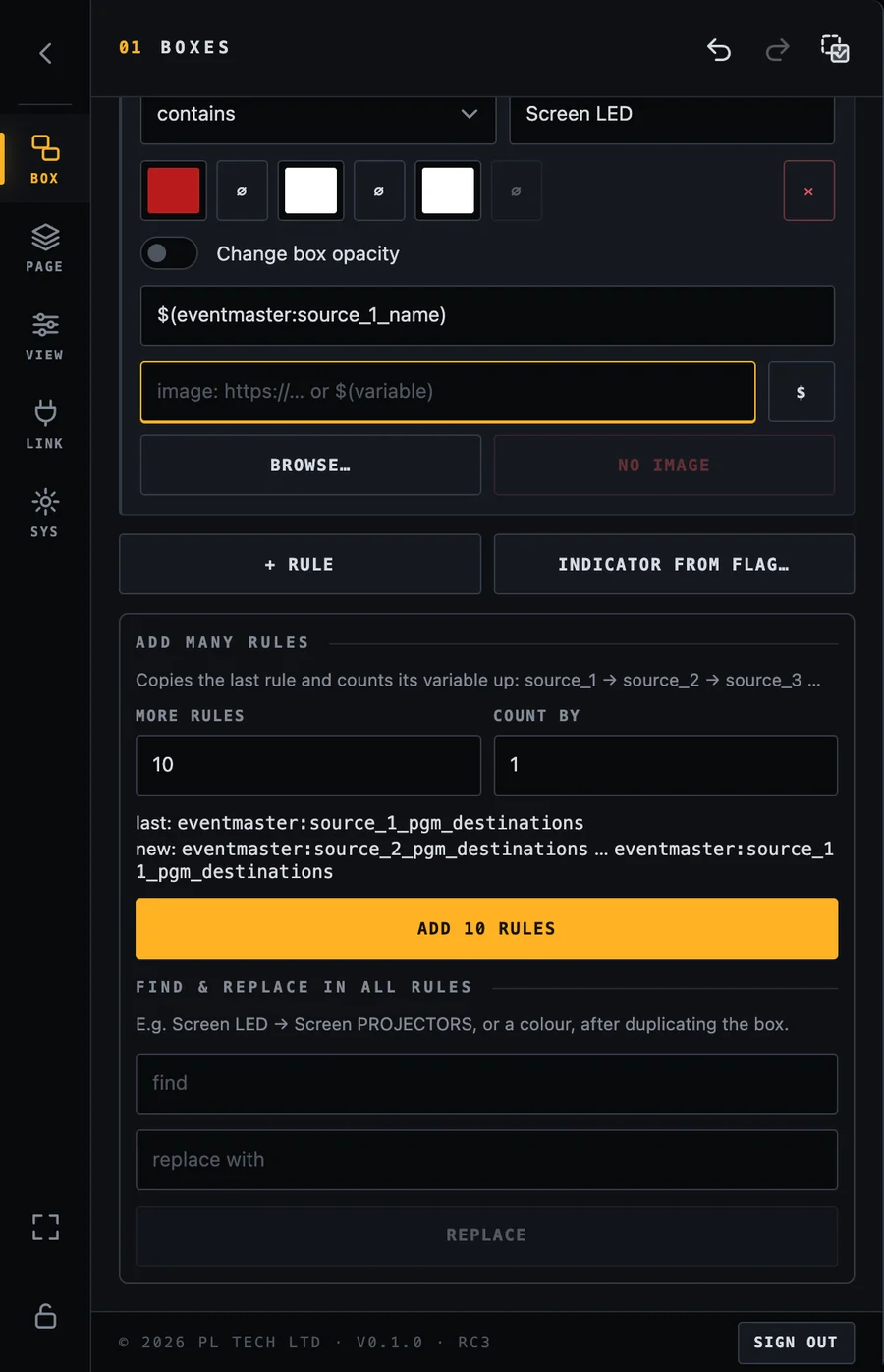
Add many rules copies the last rule and counts its variable up (source_1, source_2, source_3 …). Perfect for a box that must change for each of ten inputs.
Find & replace in all rules changes a word everywhere, for example after you duplicated a box for another screen.
Add many rules and Find & replace.
Rules for the whole screen
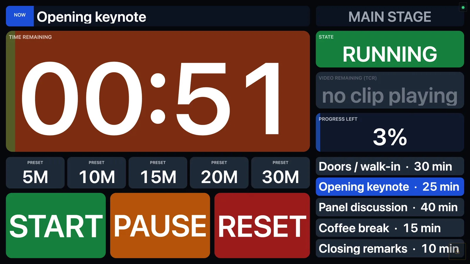
The page background can have rules as well (VIEW → Background). In the example the whole screen turns dark red while the timer is in overtime, which is hard to miss across a control room.
PAUSED: the timer box turns brown and the state turns orange.Last minutes: when progress drops below 12 % the timer box turns orange.
OVERTIME: the timer box, the state tile and the whole canvas turn red.
Box settings: Action (make boxes do something)
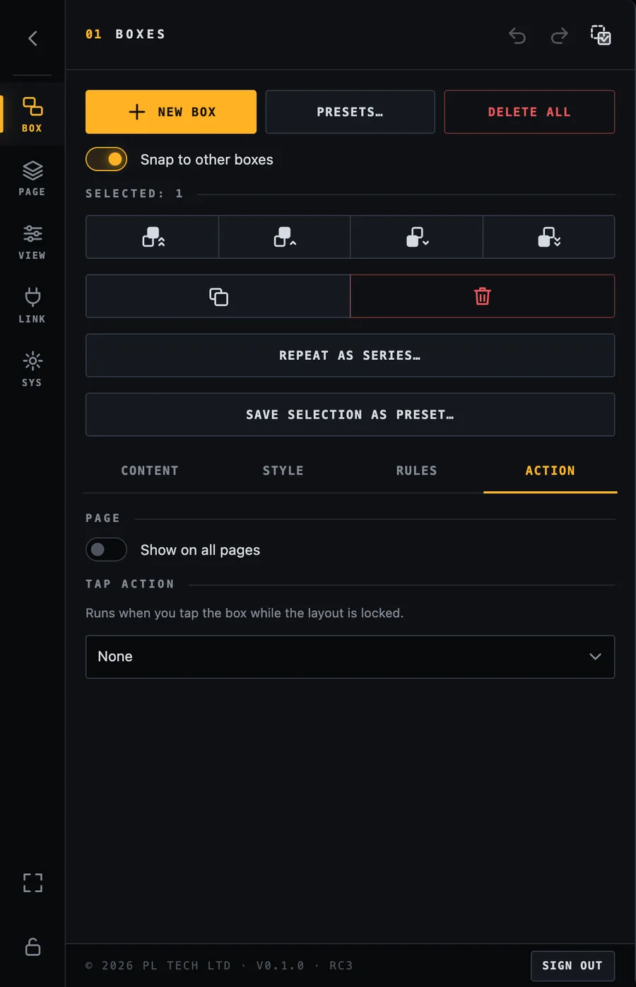
The Action tab says what a box does when you tap it while the layout is locked (see Locking).
Action tab. Choose what a tap does. “Show on all pages” puts the box on every page.
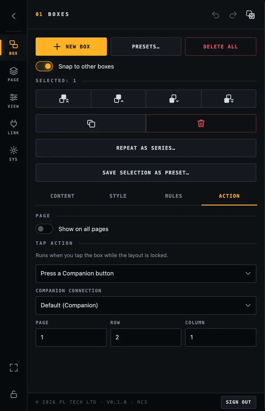
Press a Companion button
Tell Dashboard which Companion button to press: the page, row and column of the button, exactly as you see them in Companion's Buttons view. If you have several Companion computers, choose which one (the default connection is used otherwise).
Press a Companion button: connection, page, row and column.
Tip. Build your START / PAUSE / RESET and preset buttons once in Companion (the KUMA Timer module has ready-made actions and presets), then give Dashboard boxes that press them. Dashboard shows the look; Companion contains the logic and can combine many actions in one button.
Go to a page
Switch the dashboard to the next, previous or first page, or to a particular page. Use it for a navigation strip.
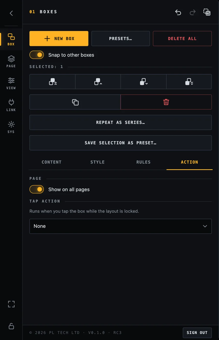
Show on all pages
A box shown on every page (here a title strip), with no tap action.
Tick Show on all pages for boxes that belong to the whole dashboard, such as a page-switch bar, a clock or a title strip. Otherwise a box lives only on the page where you created it.
Arranging many boxes
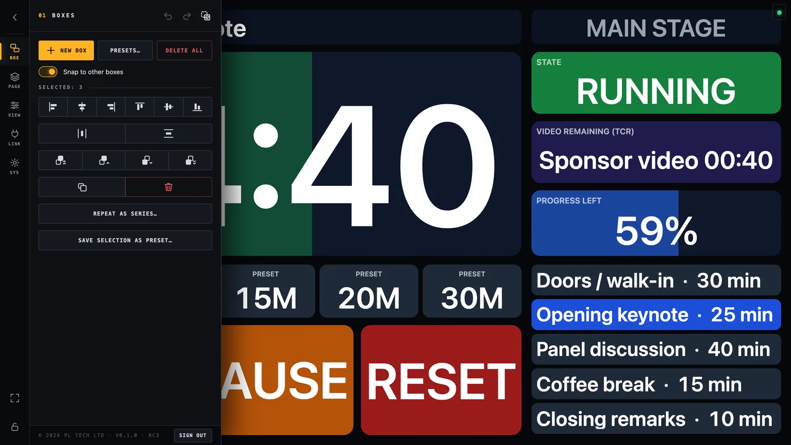
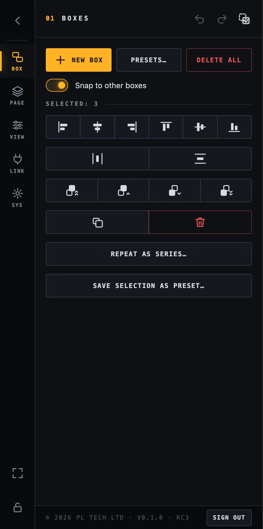
Select more than one box (drag a rectangle, or use Multi-select) and BOX shows alignment tools:
Three boxes selected with the arranging tools open.Selection tools: align left / centre / right / top / middle / bottom, distribute (three or more boxes), bring to front / back, duplicate, delete.
Align left, horizontal centre, right, top, vertical middle, bottom.
Distribute evenly horizontally or vertically (three or more boxes).
Order: bring to front, forward, backward, send to back, for boxes that overlap.
Duplicate and Delete. Delete all empties the page after a second confirmation press (“Sure?”).
Repeat as series
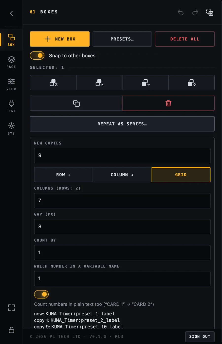
Need ten identical tiles for ten inputs? Build one, select it and press Repeat as series…. Dashboard makes numbered copies and counts the number in each variable up for you (preset_1_label, preset_2_label, …) and lays them out as a row, a column or a grid with the gap you choose. A preview shows the first and last variable before you press Create.
Repeat as series: copies, layout, gap and a preview of the variable counting up.
Save a selection as your own preset
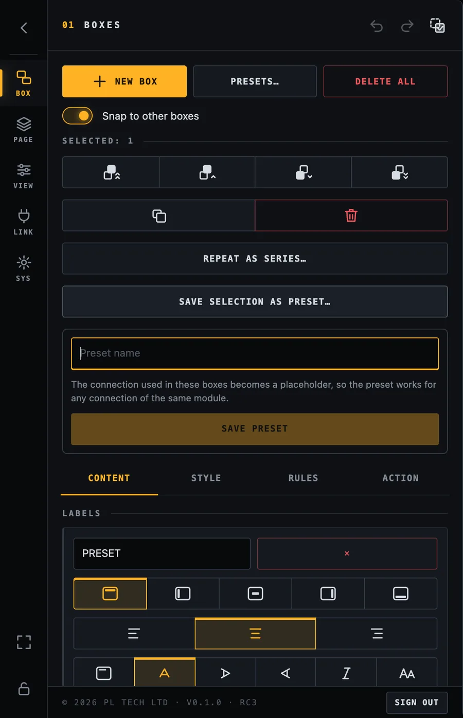
Got a combination you will use again (a timer block, a camera tile)? Select its boxes and press Save selection as preset…. It is stored under My presets (next chapter) and can be added to any dashboard. The connection used becomes a placeholder, so the preset works with any connection of the same module.
Saving the selection as a preset.
Presets: ready-made boxes
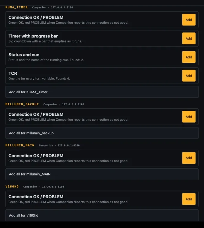
You do not have to build everything from scratch. BOX → Presets… reads which modules your Companion has and offers matching boxes built from the variables your system really has: the number of sources, cards or screens is not typed in by you.
Presets for the connected Companion modules, e.g. KUMA: Timer with progress bar, Status and cue, TCR.
Any module: a green OK / red PROBLEM tile that follows Companion's own connection status.
KUMA Timer:Timer with progress bar, Status and cue, TCR (time left of the playing video).
Video switchers and other modules: for example program and preview per mix effect and aux outputs for ATEM, power supplies and cards for Barco E2 / EventMaster.
Press Add to place a preset (it lands below what you already have, selected, ready to drag), or Add all for… for a whole module. Reload from Companion reads Companion again after you add a module. Under My presets are the ones you saved yourself.
One box, many sources: what is on PGM and PVW of a screen
A very common question in a production: what is on the LED wall right now, and what is waiting in preview? The answer is not one variable. A video processor such as a Barco E2 or EventMaster tells you, for every input, on which screens it is currently in program or preview. With 20 inputs that is 20 variables, and any one of them can be the answer. Dashboard solves this with one box that has one rule per input, and it has a shortcut so you do not enter the 20 rules one by one.
Quickest way: if your Companion connection is an E2 or EventMaster, open BOX → Presets… and add PGM: which input is on each screen. It builds exactly this, one box per screen. Read on when you want to understand it, change it, or build the same thing for a module that has no preset.
The idea
The E2 module in Companion gives every input two variables that list the screens it is on, for example eventmaster:source_4_pgm_destinations holds Screen LED while input 4 is in program on that screen (and is empty otherwise), plus its name eventmaster:source_4_name. (eventmaster is the connection name; yours may differ, pick the variables with … as usual.) The box looks at all inputs in turn. The first input whose list contains the screen name wins, and the box shows that input's name:
then show the text $(eventmaster:source_N_name) and colour the box red.
When nothing matches, the box keeps its normal look (grey, with a dash). If two inputs are on the same screen at once (a key over a background), the rule that is higher in the list wins, because the first matching rule wins.
Build it
Make the box with New box. Give it a value of — (shown when nothing matches), a big font and a bar label such as LED · PGM ("Content" tab).
Add the first rule (RULES → + Rule): variable eventmaster:source_1_pgm_destinations, comparison contains, value Screen LED (type the screen name exactly as the module reports it), background red, and as the rule's text $(eventmaster:source_1_name).
The first rule, for input 1. The text field uses the name variable of the same input.
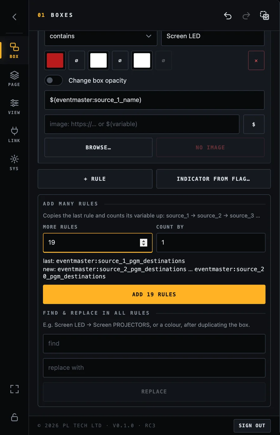
Add the other 19 at once. Scroll down to Add many rules, type 19 in More rules and look at the preview: it shows the last rule and the range that will be created (source_2_pgm_destinations … source_20_pgm_destinations). Press Add 19 rules.
Add many rules copies the last rule and counts the number in its variable up. The number in the rule text (source_1_name → source_2_name) counts along with it.
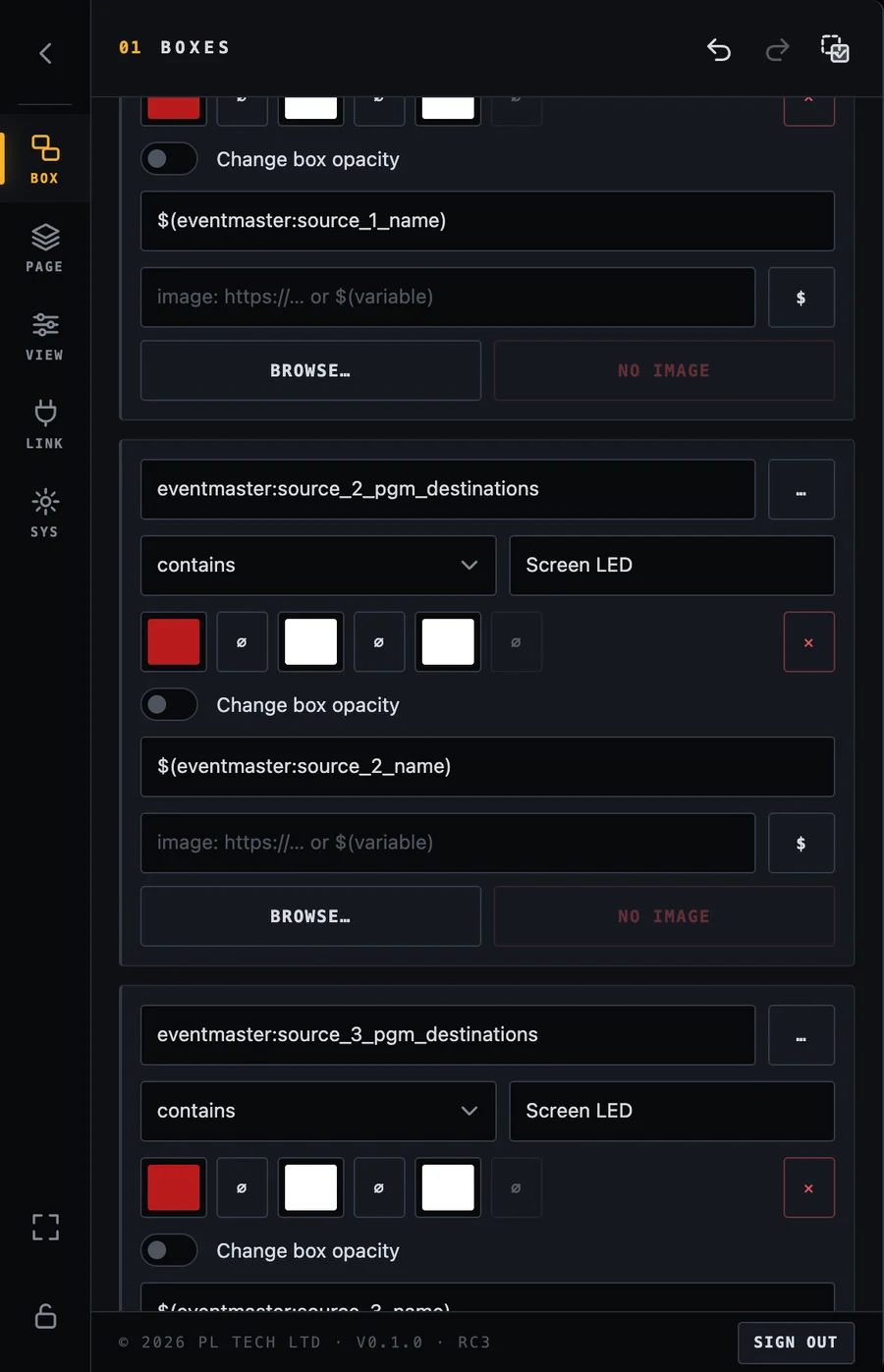
The copies keep the comparison, value and colour, and the number in the rule's text counts up together with the variable, so rule 7 reads source_7_pgm_destinations and shows $(eventmaster:source_7_name). Count by is the step, useful when inputs are numbered 1, 3, 5.
Twenty rules were made in one tap. Scroll the Rules tab to check any of them.
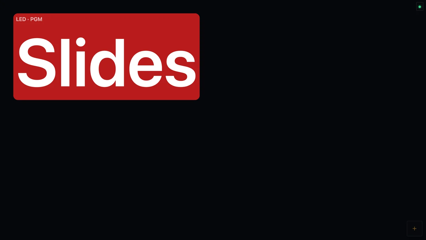
Look at the result. With input 4 in program on the LED wall the box shows its name:
One box, red, showing Slides: input 4 is in program on Screen LED.
Make the PVW box, and the same for a second screen
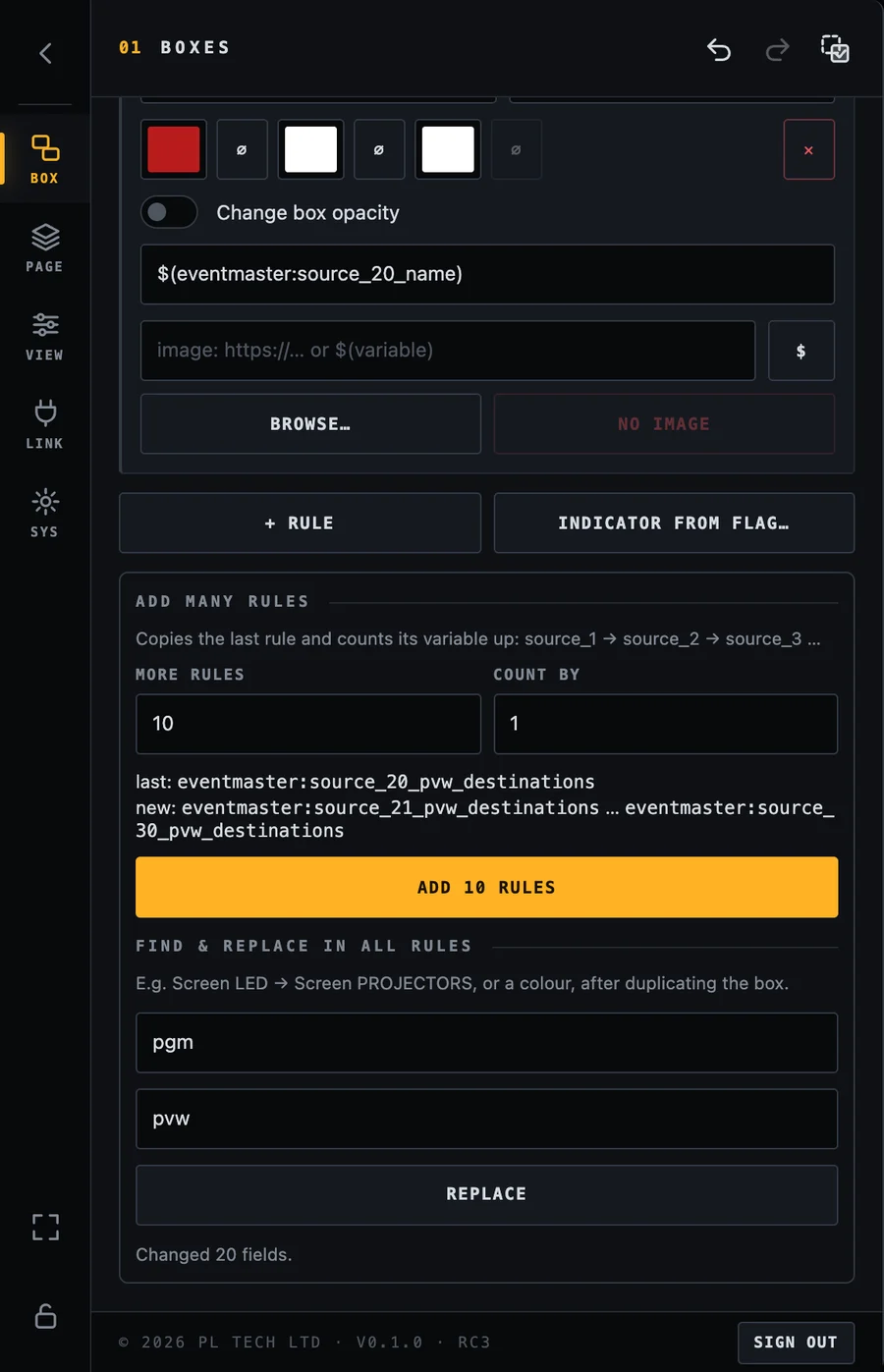
You do not repeat any of this. Duplicate the box (the duplicate icon in the BOX tab, or Ctrl/Cmd+D) and use Find & replace in all rules at the bottom of the Rules tab on the copy:
Find
Replace with
What it does
pgm
pvw
All 20 rules now read the preview lists. The tool reports Changed 20 fields.
#b91c1c
#15803d
Red becomes green, the usual colour of preview.
LED
DSM
For another screen: the value to look for changes from Screen LED to Screen DSM in all rules.
Find & replace after duplicating: all 20 rules of the copy now look at preview instead of program.
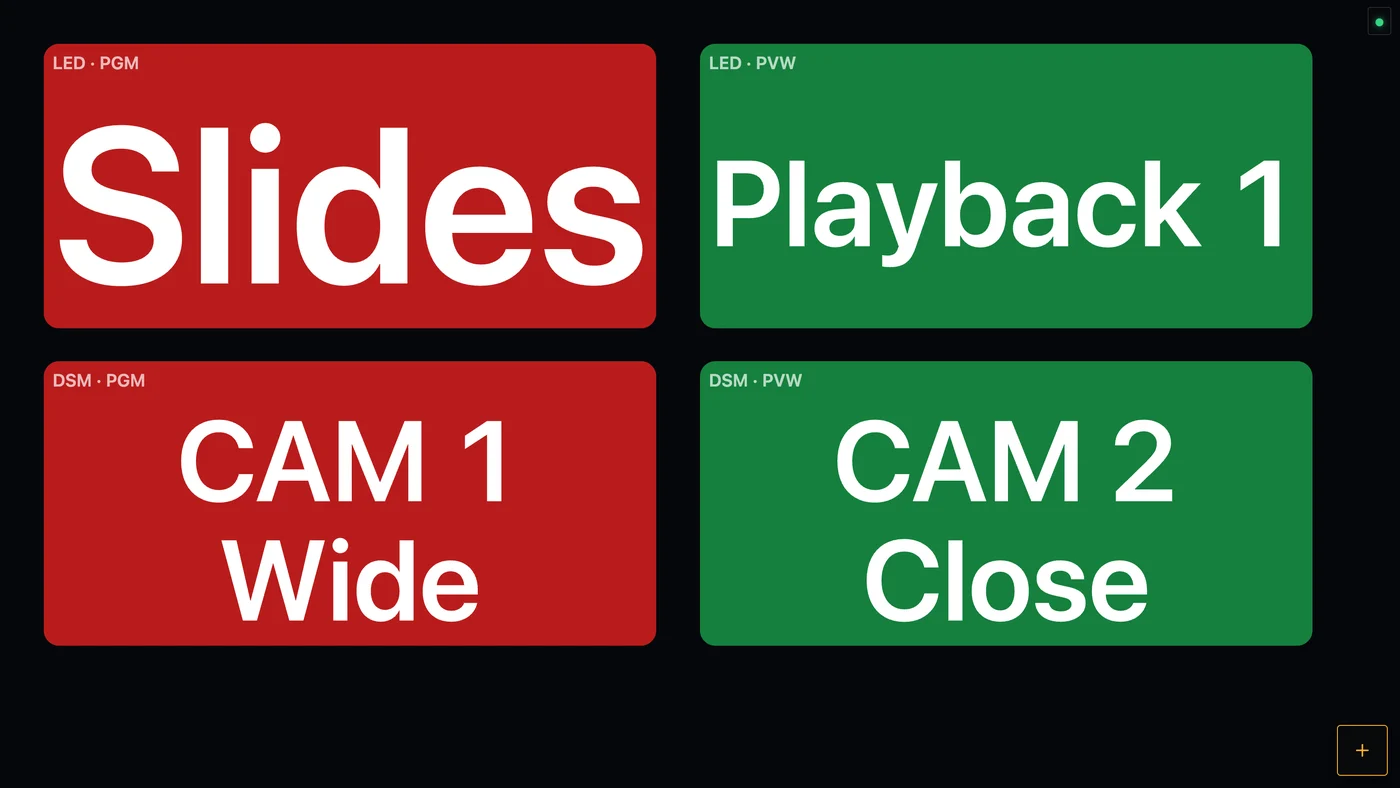
Finally change the bar label of the copy (Content tab) to LED · PVW. Four boxes, two screens, program and preview, and every one of them follows all 20 inputs:
The finished panel for an LED wall and a DSM (confidence monitor) screen. Red is program, green is preview.
Tip: make and test the first box fully before you duplicate it. Everything in a box (font, border, size, colours) is copied, so the copies only need the three replacements above.
Other uses of the same trick
Router or matrix: one box per destination, one rule per source (destination_N_source, text is the source name).
Several things in one box: end the rule list with a rule on a different variable (a warning, a fault flag). Put it at the top so it wins over everything else.
Several sources at the same time: if one box must show two inputs (for example a key and a background), make two boxes, or use Repeat as series to lay out one box per input.
Share the panel:SYS → Configuration → Save writes the whole dashboard into one file. Load it on another computer to get the same panel, then only change the connection in LINK.
Pages
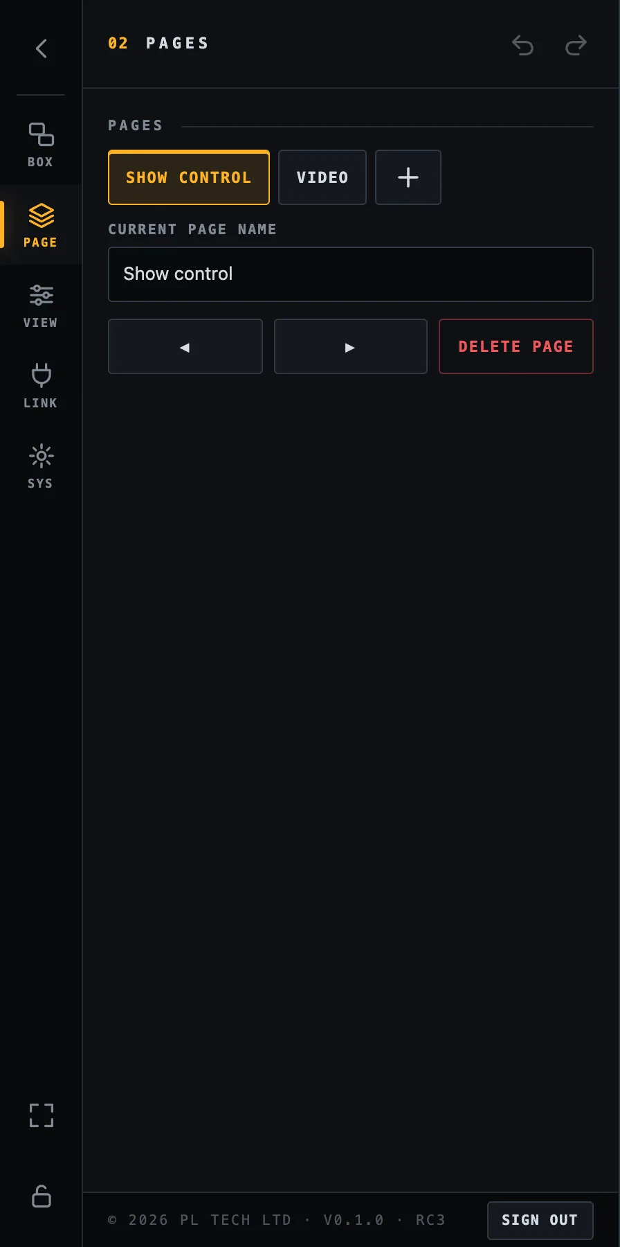
One screen is rarely enough, so a dashboard can have several pages, like tabs. Open PAGE to add (+), rename, reorder (◀ ▶) and delete pages. Deleting a page deletes its boxes, after a confirmation press. Switch pages by tapping the page in this list, or with a box whose action is Go to a page.
PAGE: your pages, the name of the current one, reorder and delete.A second page for the video operator: program and preview, the KUMA timer as a bar, source buttons and CUT / AUTO / FTB.
Look of the whole screen (VIEW)
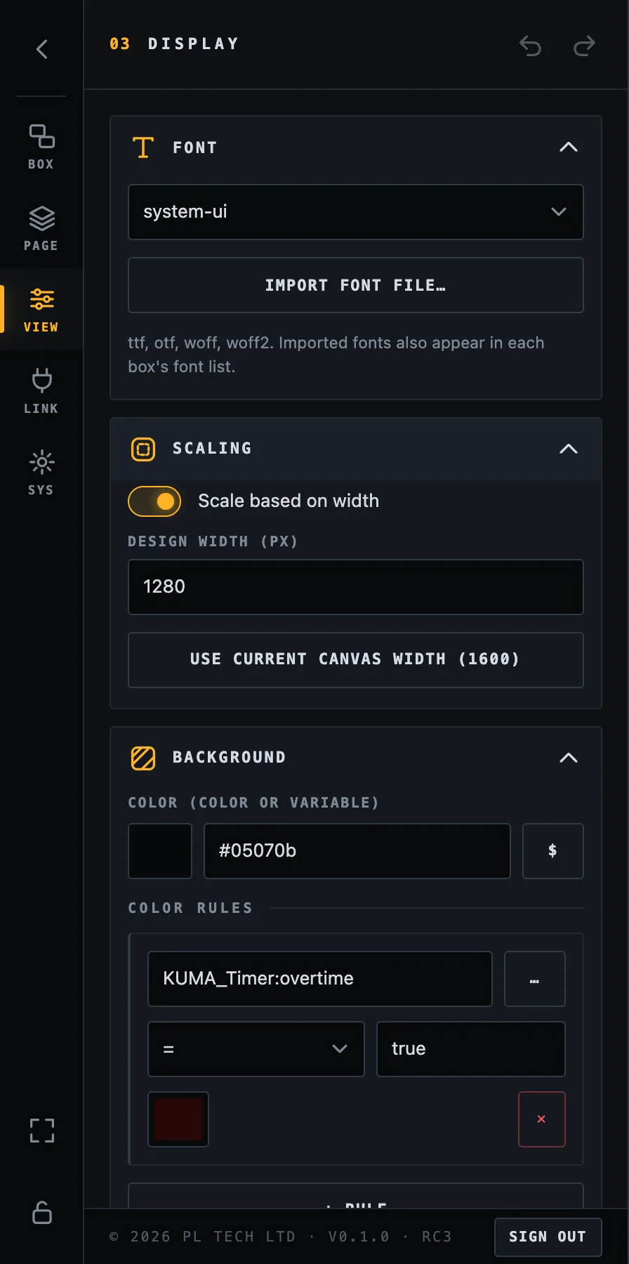
The VIEW section affects the entire dashboard.
VIEW: font and scaling.
Font
Choose the default font or import your own (ttf, otf, woff, woff2), for example your event's brand font. Imported fonts also appear in every box's own font list.
Scaling and design width
Dashboard draws your boxes on a canvas that is scaled to the width of the window, so a layout looks the same on a small laptop and on a large display. The design width (default 1280) is the width of that canvas in pixels. The height follows the shape of the window:
Screen
Shape
Canvas (design width 1280)
Laptop, monitor, TV
16:9
1280 × 720
Right two thirds of a 2560×720 bar screen
2.37:1
1280 × 540
iPad, 4:3 tablet
4:3 – 1.43:1
1280 × about 900–960
So: draw each page for the screen it will be shown on (a page for the bar, a page for the tablet). Use Use current canvas width to match the design width to the window you are working in.
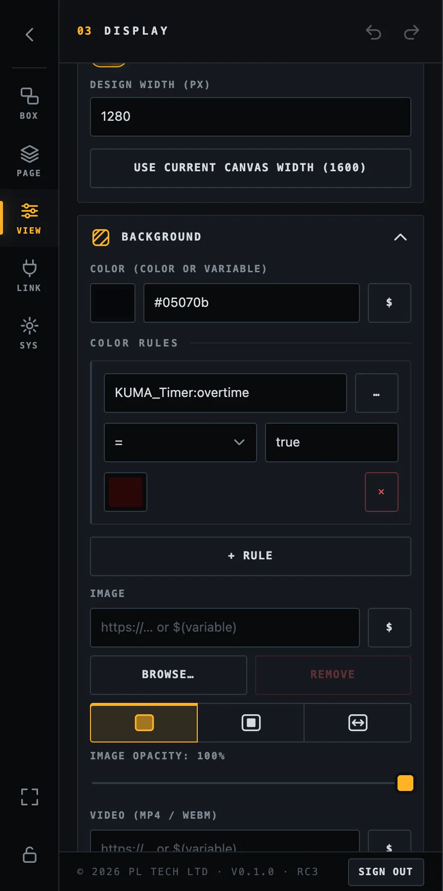
Background
The colour of the page (or a variable that holds a colour), colour rules (change the whole screen when something happens, such as red in overtime), and an optional background image or video.
Background colour, a colour rule (red screen when the KUMA overtime flag is true) and images.
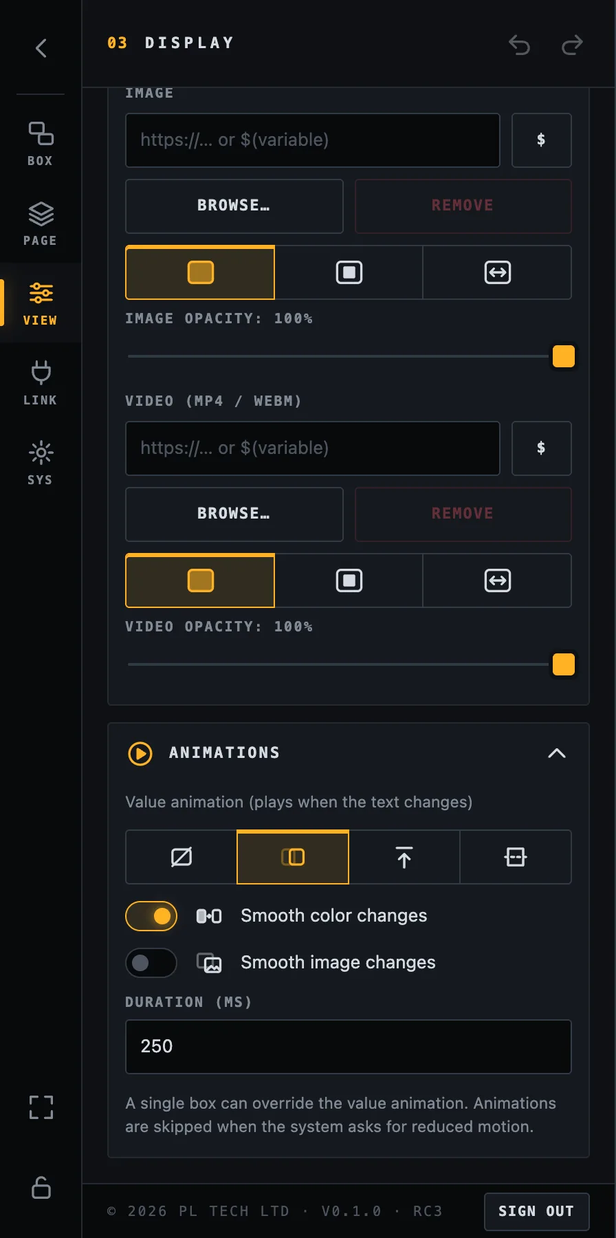
Animations
The default animation for changing values (none, fade, slide, flip), smooth colour changes, smooth image changes and the duration. A single box can override the value animation.
Animations.
Locking: from editor to control panel
While unlocked, tapping a box selects it. While locked, tapping a box does its action (presses the Companion button or switches the page), the menu is gone and nothing can be moved by accident. Lock the layout before the show.
Lock: press the padlock at the bottom of the menu rail.
Unlock:press and hold the padlock button at the bottom right for one second. A ring fills up and the padlock pops open. The hold is deliberate: nobody unlocks it by an accidental tap in the dark.
A locked dashboard: only a faint padlock remains at the bottom right.
Make a screen that always looks right
Keep the big read-outs (timer, status) big and the touch buttons at least about 80 pixels on the canvas.
Use colour with rules rather than text alone, so state is visible from across the room.
Switch off Show connection status on screen only when you trust the link. The dots are a free early warning.
Web server: tablets, phones and TVs
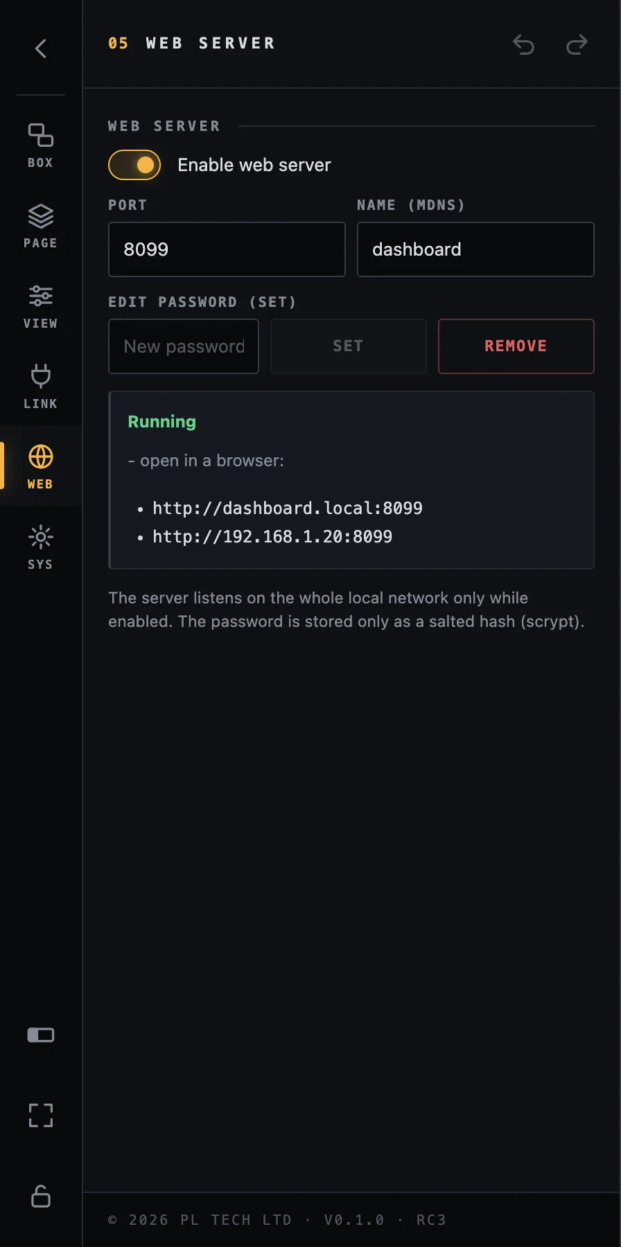
Open WEB (desktop app) and switch on Enable web server. Dashboard now serves your screen to every browser on the same network. The addresses to open are listed right there, for example http://dashboard.local:8099 or the computer's IP address. Type one into the browser of an iPad, a phone or a smart TV.
WEB: the server switch, port, name, password and the addresses to open.
Port (default 8080) and Name (the .local name, default dashboard).
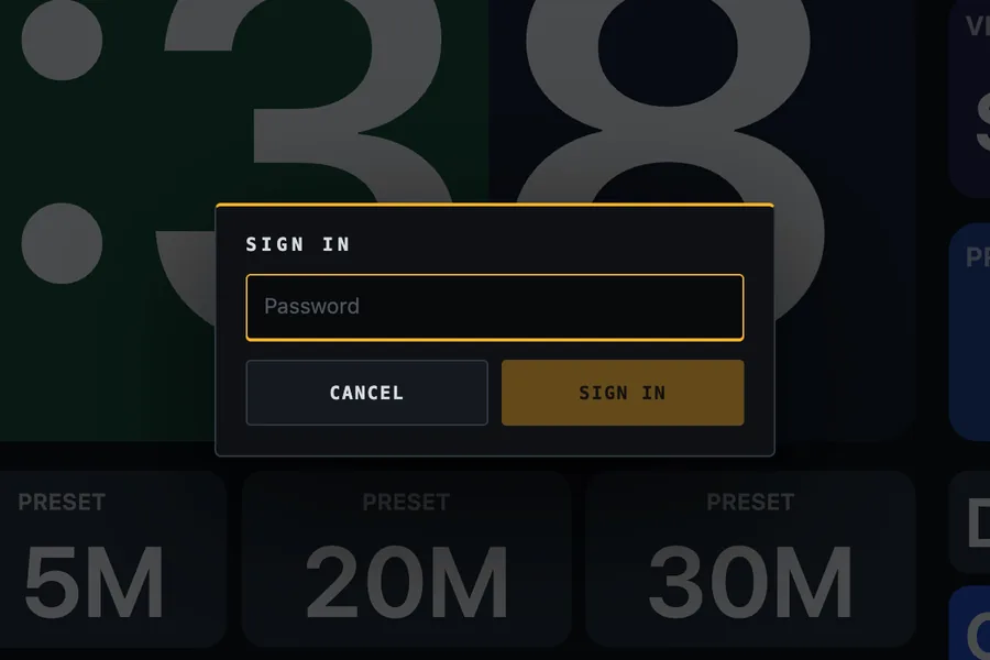
Edit password: without one, every browser is view-only (it can look at the dashboard but not change it or press buttons). Set a password and browsers can sign in with the small key button to edit and press.
The password is stored only as a salted hash; failed sign-ins are slowed down automatically.
The server listens on your local network only while it is enabled.
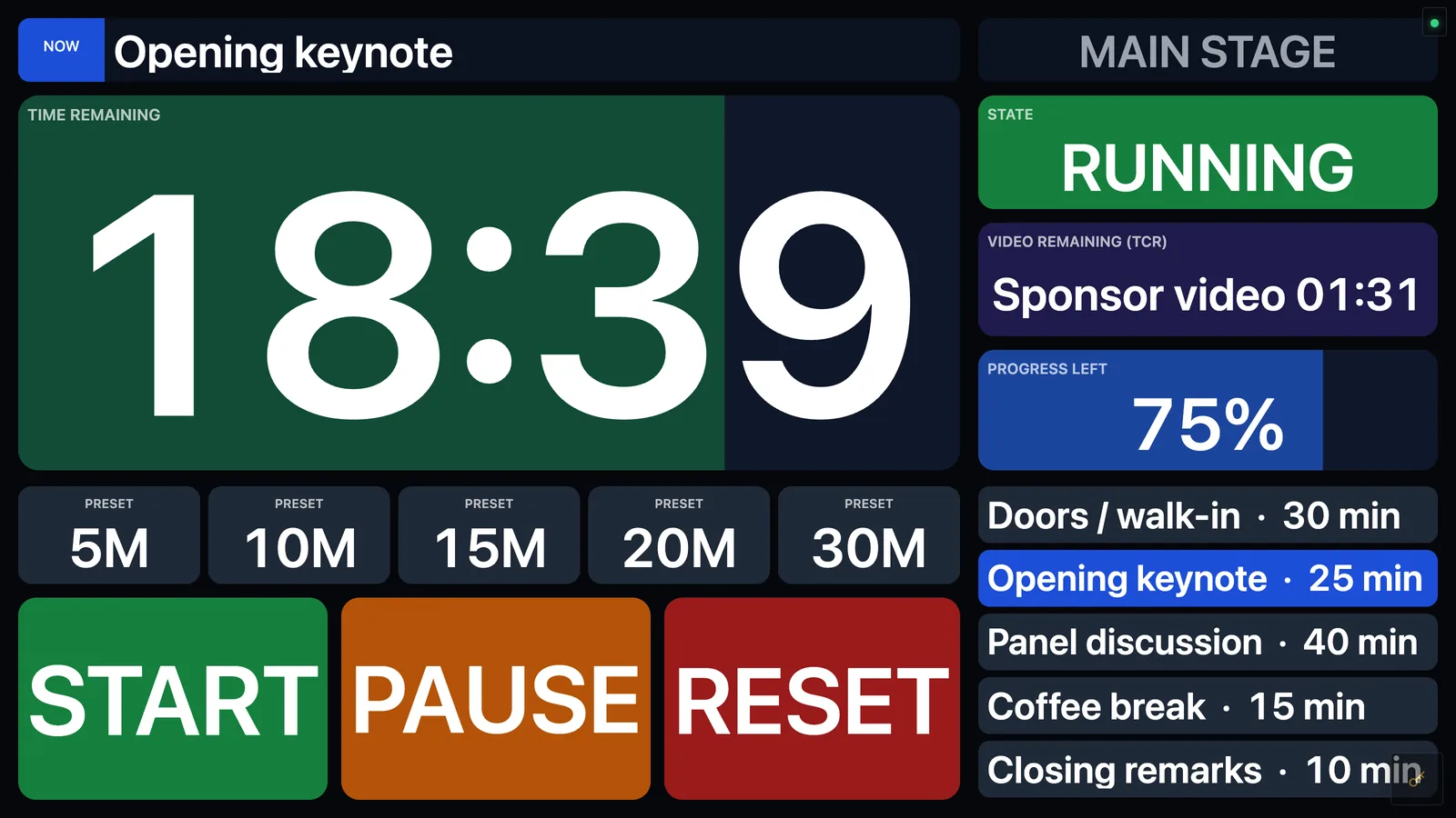
A browser without a password: view-only, with the key button at the bottom right.Signing in from the browser to edit and press buttons.
Changes made on one device show up on the others a moment later, so you can edit on the laptop and watch the tablet update. A browser works like the app, with two differences: the WEB section and the window options (wide-screen, auto-fit) exist only in the desktop app.
Security. View-only mode is for trusted networks (a production LAN). If the network is shared with the audience, set a password.
Wide-screen mode: Dashboard beside KUMA
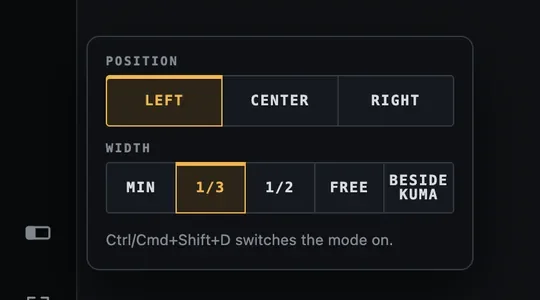
On a screen that is much wider than it is tall (2.3 : 1 or wider, such as a 2560×720 bar display) Dashboard shows a wide-screen button at the bottom of the menu rail. Tap it (or press Ctrl/Cmd + Shift + D anywhere) to turn the mode on: the window loses its title bar, takes the full usable height of the screen and snaps to a slot, so it can stand next to KUMA's own wide-screen strip.
Right-click the button, or press and hold it, to choose the options:
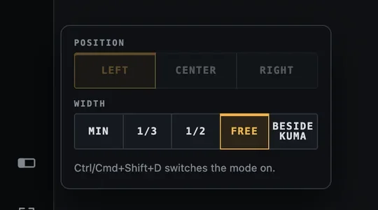
Wide-screen options: position and width.With Free, thin handles appear on both sides of the window.
Option
Meaning
Position Left / Center / Right
Where the strip sits on the screen.
Width Min
The narrowest the layout allows (480 pixels).
1/3 and 1/2
One third or half of the usable screen width.
Free
You pull the edges yourself (the first time it is 700 pixels wide). Drag the thin strip at the top to slide the window sideways.
Beside KUMA
Dashboard takes whatever KUMA leaves free. KUMA tells Dashboard where its strip is (checked every two seconds), so if you move or resize KUMA, Dashboard follows. If KUMA is not running, Dashboard stays where it is.
Beside KUMA needs KUMA on the same computer and uses KUMA's address from SYS → KUMA address (it works out the port by itself). In KUMA, switch on its own Wide-screen kiosk and choose where its strip sits; Dashboard fills the rest.
The mode is remembered and restored at start only while a wide screen is connected, so a laptop that is sometimes undocked is not left with a strange window. SYS → Window → Auto-fit window height to the screen additionally keeps a normal window from running off a short screen.
Dashboard's wide-bar page at the size of the slot next to KUMA.
The wide-screen button is visible on wide screens (and whenever the mode is on, so you can always switch it off). Its options are Dashboard's desktop app only, not the browser.
System: licence, files and updates
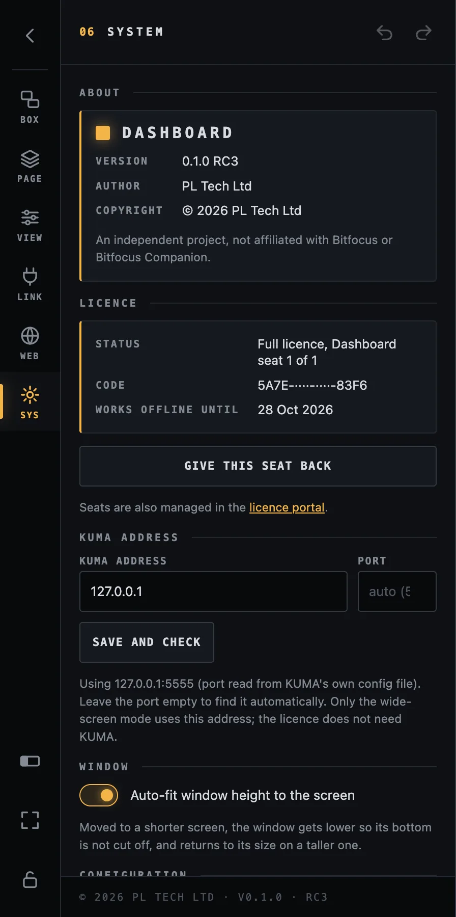
SYS: about, licence status, give the seat back, KUMA address.
Licence: your licence type, the seat Dashboard holds (for example seat 1 of 1), the code (partly hidden) and how long Dashboard keeps working offline. Give this seat back frees it to use on another computer.
KUMA address: only for the Beside KUMA wide-screen mode (host and, optionally, port). Leave the port empty to find it automatically.
Window → Auto-fit: keeps the window within a short screen.
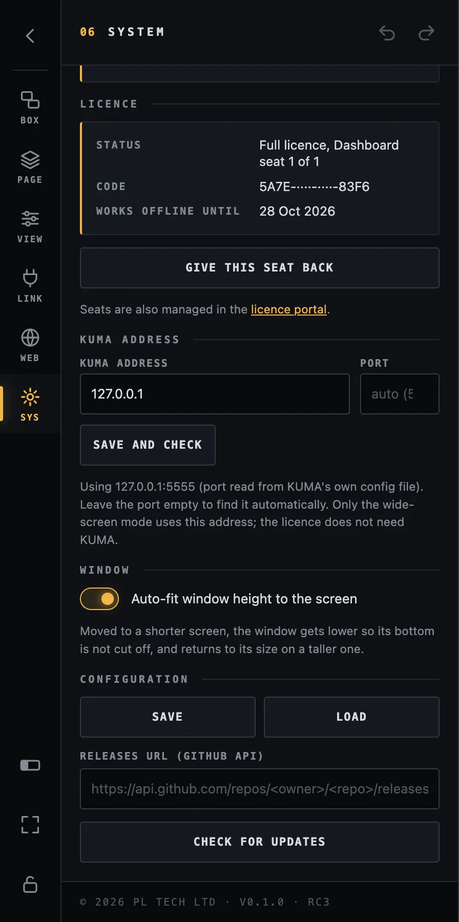
Configuration → Save / Load: saves everything (pages, boxes, connections, imported images, videos and fonts) into one file and loads it back. Use it as a backup and to move your dashboards to another computer.
Releases URL / Check for updates: an optional manual check for a newer version. It only tells you; nothing is downloaded or installed by itself.
SYS: the rest of the section, with configuration save and load.
Back up before a big show. After the layout is finished, press Configuration → Save and keep the file with your show files. Loading it on a spare computer gives you an identical dashboard in seconds.
Recipes for event production
Practical set-ups, from the simplest to a full multi-screen show. The finished example dashboard in this guide is built from these pieces.
1. Stage manager's panel
Goal: one screen that tells you the time, the state and the next cue, and lets you run the show with your thumb.
Add Timer with progress bar and Status and cue from the KUMA presets and make the timer the largest box.
Add rules to the timer: red when KUMA_Timer:overtime is true, orange when KUMA_Timer:progress is below 12.
Add START, PAUSE and RESET boxes with Press a Companion button pointing at the KUMA buttons in Companion; add boxes for your presets (5, 10, 15 minutes) with the same action.
Add a cue list: five boxes with $(KUMA_Timer:cue_1_name)…cue_5_name (or build one and Repeat as series). Give each a rule that highlights it when KUMA_Timer:cue_index equals its number.
Lock the layout. Put the screen where the stage manager can reach it.
2. Video operator's page
Add program and preview tiles from the switcher's presets (or two boxes with $(atem:pgm1_input) and $(atem:pvw1_input)), with a red and a green border and a bar label PROGRAM / PREVIEW.
Add the KUMA timer as a thin box with a progress bar, so the operator sees the clock without leaving the page.
Add source buttons and CUT / AUTO / FTB with button-press actions.
Give the page its place in the navigation, with a Go to a page box that is shown on all pages.
3. Status wall for technicians
Open Presets… and press Add all for each connected module. Every module gets an OK / PROBLEM tile and modules with more detail (power supplies, cards) get their own tiles. Arrange them in a grid with the alignment tools. A single glance tells you which device dropped out.
4. Producer's tablet
Enable the web server, add a page drawn for the tablet's shape and open the address in the tablet's browser. Leave the password empty for a view-only status screen, or set one so the producer can also press buttons.
5. Confidence screen in the green room
Show the timer large, the running cue name and the clock on a TV or monitor through a browser in full screen. No password, no buttons, just information.
6. Several rooms, one screen
Add a connection for each Companion computer (LINK → Add connection, give each a clear name). Use the picker to pick variables from each: Dashboard writes the right alias for you. One screen can now show the main stage, the breakout room and the registration desk.
Troubleshooting
What you see
What to check
Red dot (top right) / values show ⚠
Dashboard cannot reach Companion. Check the address in LINK (host and port), that Companion is running, and that both computers are on the same network and not blocked by a firewall.
A box shows …
The variable has no value (yet): wrong name, the Companion connection is disabled, or it is still reading. Open the variable picker and insert it again.
Tapping a box does nothing
The layout is not locked (tap = select), or the box has no action. Check Action, and that the page / row / column match the Companion button.
The bottom of my layout is cut off
The page was drawn for a different screen shape. See Design width: make a page for this screen's shape.
A box is missing on another page
Boxes belong to the page they were created on. Tick Show on all pages to show it everywhere.
I cannot edit in the browser
The browser is view-only. Set an Edit password in WEB (desktop app) and sign in with the key button.
“All Dashboard seats on this licence are in use”
Free a seat: Give this seat back on the other computer, or release it in the licence portal.
“Could not reach the licence server”
Only needed when activating. Once activated, Dashboard keeps running for at least two weeks offline.
The wide-screen button is missing
It only appears on a screen that is at least 2.3 times wider than it is tall (or while the mode is on).
Beside KUMA does not move the window
KUMA must run on the same computer with its own wide-screen kiosk switched on. Check SYS → KUMA address.
Still stuck? Write to support@kumatimer.app with a screenshot and a copy of your saved configuration file.
Tips
Build once, then duplicate and change. Duplicating a box and using Find & replace in all rules is faster than starting over.
Use Undo freely; use Save (SYS) before big changes.
Name your Companion connections clearly; the names appear in the picker and in aliases.
For readable timers: Auto-fit, bold, a high-contrast colour, and a rule for overtime.
A progress bar behind the numbers shows how much time is left at a glance, even when you cannot read the digits.
Keep one page per screen shape; scale the same layout up only if the screens have the same shape.
Glossary
Word
Meaning
Box
A tile on the dashboard: text, colour, image, a bar, a tap action.
Page
One screen of boxes. A dashboard has one or more pages.
Companion
Bitfocus Companion, the program that talks to your show equipment and holds the buttons.
Connection
One Companion computer (address and port) that Dashboard reads from.
Variable
A live value from Companion, written $(connection:name).
Template
The text of a box, which may contain variables.
Rule
“When this variable matches, change the look.”
Label
A caption on an edge of a box, optionally as a coloured bar.
Preset
Ready-made boxes for a Companion module, or your own saved selection.
Design width
The width of the canvas your boxes are drawn on, scaled to the window.
TCR
Time Code Remaining: the time left of a clip that is playing in QLab, Mitti, Millumin or PowerPoint (via KUMA).
Seat
One computer's right to use Dashboard on your licence.